Intro
This week, we’ll be cleaning data.
Cleaning data is labor intensive and requires making subjective choices.
We’ll focus on, and assess you on, manipulating data correctly, making reasonable
choices, and documenting the choices you make carefully.
We’ll focus on the programming tools that get used in cleaning data in class this week:
reshaping data
handling missing or incorrect values
renaming columns
import pandas as pd
import seaborn as sns

sns.set_theme(font_scale=2, palette='colorblind')
Note here we set the theme and pass the palette and font size as paramters.
To learn more about this and the various options, see the seaborn aesthetics tutorial
What is Tidy Data?
Read in the three csv files described below and store them in a dictionary
url_base = 'https://raw.githubusercontent.com/rhodyprog4ds/rhodyds/main/data/'

data_filename_list = ['study_a.csv','study_b.csv','study_c.csv']
Here we can use a dictionary comprehension
example_data = {datafile.split('.')[0].split('_')[1]:pd.read_csv(url_base+datafile) for datafile in data_filename_list}this is a dictionary comprehension which is like a list comprehension, but builds a dictionary instead. in the first pass
datafile='study_a.csv'splitis a string method that splits the string at the given character and returns a list (in the first pass['study_a','csv'])[0]then takes the first item out'study_a'then the next
splitmakes another list['study','a'][1]then takes the second item from the list (e.g.'a'):makes the part to the left a key and right the valuewe can add strings to combine them
the same data 3 ways
We can pick a single on out this way
example_data['a']example_data['b']example_data['c']These three all show the same data, but let’s say we have two goals:
find the average effect per person across treatments
find the average effect per treatment across people
This works differently for these three versions.
For a we can easilty get the average per treatment, but to get the
average per person, we have to go across rows, which we can do here, but doesn’t work as well with plotting
we can work across rows with the axis parameter if needed
For B, we get the average per person, but what about per treatment? again we have to go across rows instead.
For the third one, however, we can use groupby, because this one is tidy.
Encoding Missing values
We can see the impact of a bad choice to represent a missing value with -
example_data['c'].dtypesperson object
treatment object
result object
dtype: objectone non numerical value changed the whole column!
example_data['c'].describe()so describe treats it all like categorical data
We can use the na_values parameter to fix this. Pandas recognizes a lot of different
values to mean missing and store as NaN but his is not one. Find the full list
in the pd.read_csv documentation of the na_values parameter
example_data = {datafile.split('.')[0].split('_')[1]:pd.read_csv(url_base+datafile,na_values='-')
                for datafile in data_filename_list}
now we can checka gain
example_data['c'].dtypesperson object
treatment object
result float64
dtype: objectand we see that it is float this is because NaN is a float.
example_data['c']Now it shows as Nan here
Computing on Tidy Data
These three all show the same data, but let’s say we have two goals:
find the average effect per person across treatments
find the average effect per treatment across people
This works differently for these three versions.
To take the mean on both columns we can either pick them out or make the name the index. we’ll do the latter:
example_data['a'].set_index('name')we can take the mean down:
example_data['a'].set_index('name').mean(axis=0)treatmenta 9.500000
treatmentb 4.666667
dtype: float64which is default so the above is the same as:
example_data['a'].set_index('name').mean()treatmenta 9.500000
treatmentb 4.666667
dtype: float64or across
example_data['a'].set_index('name').mean(axis=1)name
John Smith 2.0
Jane Doe 13.5
Mary Johnson 2.0
dtype: float64but for the tidy data (c) we can use groupby instead to get the same impact
tidy_df = example_data['c']
tidy_dftidy_df.groupby('person')['result'].mean()person
Jane Doe 13.5
John Smith 2.0
Mary Johnson 2.0
Name: result, dtype: float64tidy_df.groupby('treatment')['result'].mean()treatment
a 9.500000
b 4.666667
Name: result, dtype: float64Tidying Data
Let’s reshape the first one to match the tidy one. First, we will save it to a DataFrame, this makes things easier to read and enables us to use the built in help in jupyter, because it can’t check types too many levels into a data structure.
Before
treat_df = example_data['a']
treat_dftidy_treat_df = treat_df.melt(value_vars=['treatmenta','treatmentb'],
id_vars=['name'],value_name='result',
var_name='treatment')
tidy_treat_dfWhen we melt a dataset:
the
id_varsstay as columnsthe data from the
value_varscolumns become the values in thevaluecolumnthe column names from the
value_varsbecome the values in thevariablecolumnwe can rename the value and the variable columns.
see visualized on pandas tutor
Transforming the Coffee data
First we see another way to filter data. We can use statistics of the data to filter and remove some. .
For exmaple, lets only keep the data from the top 10 countries in terms of number of bags.
arabica_data_url = 'https://raw.githubusercontent.com/jldbc/coffee-quality-database/master/data/arabica_data_cleaned.csv'
# load the data
coffee_df = pd.read_csv(arabica_data_url,index_col=0)
# get total bags per country
bags_per_country = coffee_df.groupby('Country.of.Origin')['Number.of.Bags'].sum()

# sort descending, keep only the top 10 and pick out only the country names
top_bags_country_list = bags_per_country.sort_values(ascending=False)[:10].index

# filter the original data for only the countries in the top list
top_coffee_df = coffee_df[coffee_df['Country.of.Origin'].isin(top_bags_country_list)]First we will look at the head, as usual
top_coffee_df.head()and the shape to see how big it is after we filter
top_coffee_df.shape(952, 43)We want to have some columns subsetted out for plotting
scores_of_interest = ['Balance','Aroma', 'Body', 'Aftertaste']
n_value_vars = len(scores_of_interest)
attributes_of_interest = ['Country.of.Origin', 'Color']
coffee_tall = top_coffee_df.melt(id_vars=attributes_of_interest,
                   value_vars=scores_of_interest ,
                   var_name ='score')#

tall_rows, tall_cols = coffee_tall.shape
tall_rows, tall_cols
(3808, 4)first we’ll look at the shape to help make sense of what melt does.
rows, cols = top_coffee_df.shapethe origal data had 952 rows and we converted 4 to one colum so now we have the product in number of rows
tall_rows_computed = rows* n_value_vars
tall_rows_computed3808and we can see that they match.
coffee_tall.head()This data is “tidy” all of the different measurements (ratings) are different rows and we have a few columsn that identify each sample
This version plays much better with plots where we want to compare the ratings.
This version plays much better with plots where we want to compare the ratings.
sns.catplot(data = coffee_tall, row='score', y='value',x='Country.of.Origin',
            hue='Country.of.Origin',aspect=3,
             kind='violin')
<seaborn.axisgrid.FacetGrid at 0x7f2f50ed5c70>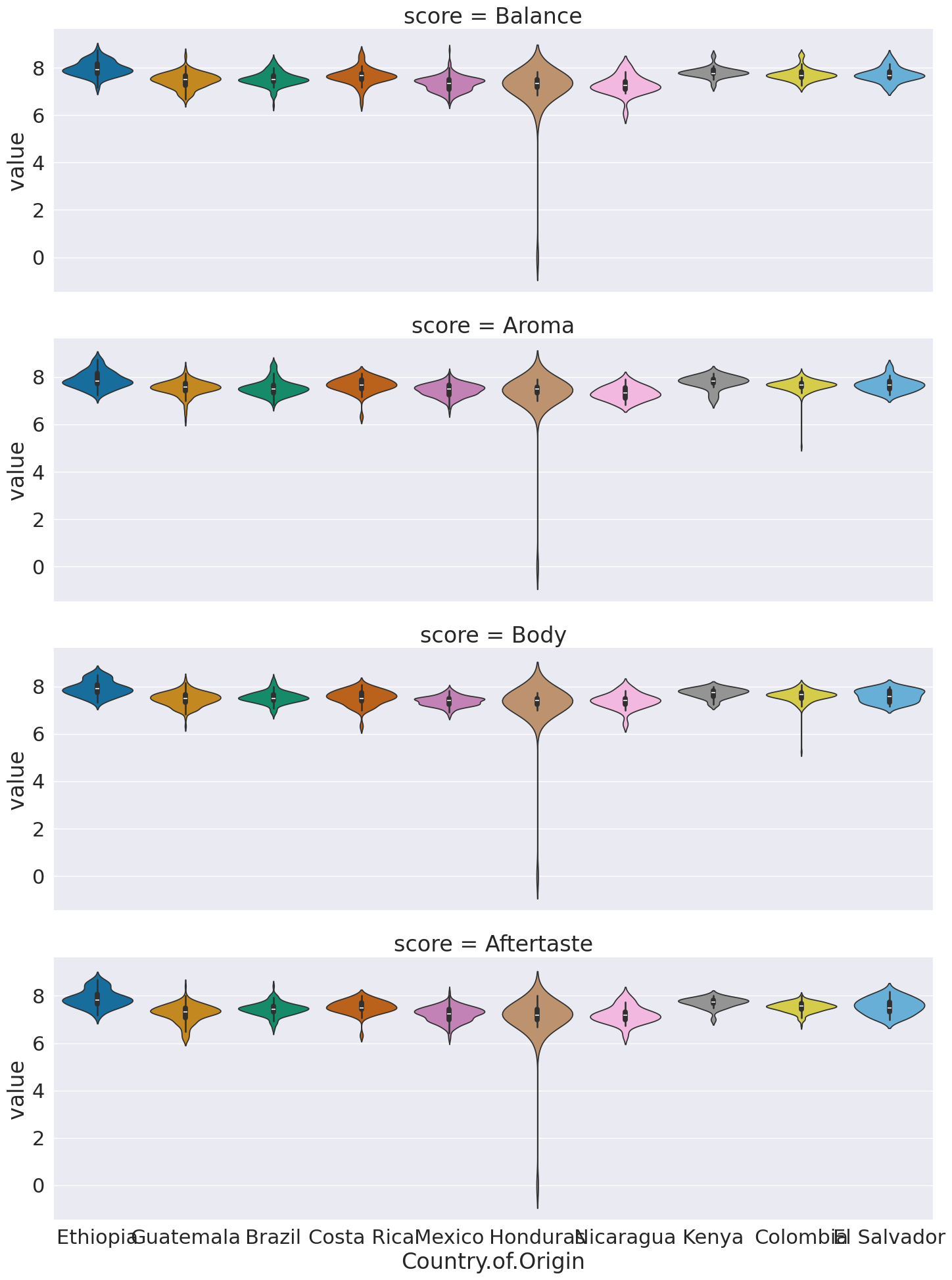
This now we can use the score as a variable to break the data by in our subplots.
I did a few new things in this:
a violin plot allows us to compare how different data is distributed.
I used both
colandcol_wrap,colalone would have made nine columns, and withoutrowall in one row.col_wrapsays to line wrap after a certain number of columns (here 3)aspectis an attribute of the figure level plots that controls the ratio of width to height (the aspect ratio). soaspect=3makes it 3 times as wide as tall in each subplot, this spreads out the x tick labels so can read them
Questions After Class
Today’s questions were mostly about melt. Read above and the linked resources.
Can you change the locations of the names next to a plot?
First, see the annotated graph and learn the technical name of the element you want to move.
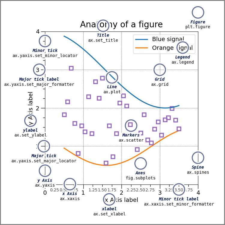
the above figure come from matplotlib’s Anatomy of a Figure page which includes the code to generate that figure
You can control each of these but you may need to use matplotlib.
If this means the legend, seaborn can control that location. If it refers to fixing overlappign tick labels, I demonstrated that above, with aspect.