Setting up for regression
We’re going to predict tip from total bill. This is a regression problem because the target, tip is:
available in the data (makes it supervised) and
a continuous value. The problems we’ve seen so far were all classification, species of iris and the character in that corners data were both categorical.
Using linear regression is also a good choice because it makes sense that the tip would be approximately linearly related to the total bill, most people pick some percentage of the total bill. If we our prior knowledge was that people typically tipped with some more complicated function, this would not be a good model.
import numpy as np
import seaborn as sns
import matplotlib.pyplot as plt
from sklearn import datasets, linear_model
from sklearn.metrics import mean_squared_error, r2_score
from sklearn.model_selection import train_test_split
import pandas as pd
sns.set_theme(palette='colorblind')
Notebook Cell
def pretty_type(object):
    '''
    return minimal types for complex object
    '''
    full_type = str(type(object)).replace('class','').strip("'<>' ")
    full_type_list = full_type.split('.')
    return ' '.join([full_type_list[0], full_type_list[-1]])
We wil load this data from seaborn
tips_df = sns.load_dataset('tips')
tips_df.head()We will, for now, use only the total_bill to predict the tip
tips_X = tips_df[['total_bill']]
tips_y = tips_df['tip']
pretty_type(tips_df[['total_bill']])
'pandas DataFrame'Next, we split the data
tips_X_train,tips_X_test, tips_y_train, tips_y_test = train_test_split(tips_X, tips_y,
                                                                       train_size=.8)
Fitting a regression model
We instantiate the object as we do with all other sklearn estimator objects.
regr = linear_model.LinearRegression()we can inspect it to get a before
regr.__dict__{'fit_intercept': True,
'copy_X': True,
'tol': 1e-06,
'n_jobs': None,
'positive': False}and fit like the others too:
regr.fit(tips_X_train,tips_y_train)and compare the after
regr.__dict__{'fit_intercept': True,
'copy_X': True,
'tol': 1e-06,
'n_jobs': None,
'positive': False,
'feature_names_in_': array(['total_bill'], dtype=object),
'n_features_in_': 1,
'coef_': array([0.09815895]),
'rank_': 1,
'singular_': array([124.96025915]),
'intercept_': np.float64(1.0005137058456053)}We can also save the predictions
tips_y_pred = regr.predict(tips_X_test)and get a score for the model
regr.score(tips_X_test,tips_y_test)0.6151662407996114or the mean squared error:
mean_squared_error(tips_y_pred,tips_y_test)0.7548917933587521Regression Predictions
Linear regression is making the assumption that the target is a linear function of the features so that we can use the equation for a line(for scalar variables):
becomes equivalent to the following code assuming they were all vectors/matrices:
i = 1 # could be any number from 0 ... len(target)
target[i] = regr.coef_*features[i]+ regr.intercept_
You can match these up one for one.
targetis (this is why we usually put the_y_in the varaible name)regr.coef_is the slope,featuresare the (like for y, we label that way)and
regr.intercept_is the or the y intercept.
We will look at each of them and store them to variables here
slope = regr.coef_[0]
intercept = regr.intercept_now we can pull out our first and calculate a predicted value of manually
x0 = tips_X_test.iloc[0].values[0]
manual_pred0 = slope * x0 + intercept
model_pred0 = tips_y_pred[0]
manual_pred0 == model_pred0np.True_and see that the manual prediction (np.float64(3.4829534438464993)) matches exactly the prediction from the predict method (np.float64(3.4829534438464993))[2].
Visualizing Regression
Since we only have one feature, we can visualize what was learned here. We will use plain
matplotlib plots because we are plotting from numpy arrays not data frames.
plt.scatter(tips_X_test,tips_y_test, color='black')
plt.scatter(tips_X_test,tips_y_pred, color='blue')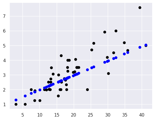
This plots the predictions in blue vs the real data in black. The above uses them both as scatter plots to make it more clear, below, like in class, I’ll use a normally inconvenient aspect of a line plot to show all the predictions the model could make in this range.
plt.scatter(tips_X_test,tips_y_test, color='black')
plt.plot(tips_X_test,tips_y_pred, color='blue')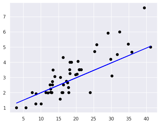
Evaluating Regression - Mean Squared Error
From the plot, we can see that there is some error for each point, so accuracy that we’ve been using, won’t work. One idea is to look at how much error there is in each prediction, we can look at that visually first, these are called the residuals.
What happened to the plot in class?
We tried to plot the residuals in class:
plt.scatter(tips_X_test, tips_y_test,  color='black')
plt.plot(tips_X_test, tips_y_pred, color='blue', linewidth=3)

# draw vertical lines frome each data point to its predict value
[plt.plot([x,x],[yp,yt], color='red', linewidth=3)
                 for x, yp, yt in zip(tips_X_test, tips_y_pred,tips_y_test)];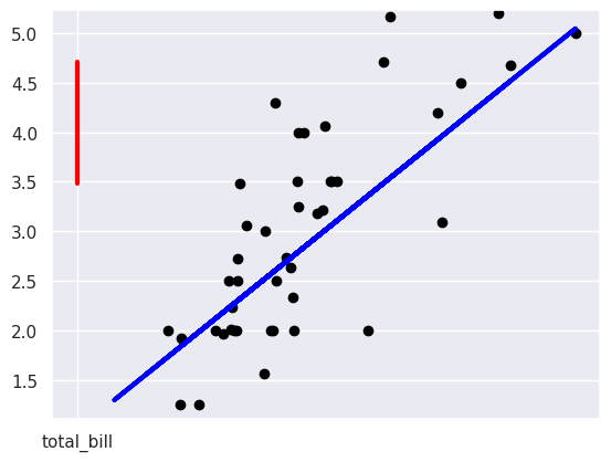
but it didn’t look right.
I should have noticed from the total_bill on the horizontal axis what was going on it ws plotting the y values vs total_bill. We can confirm that is what happened by looking at what the data provided to the plot function is:
[[[x,x],[yp,yt]] for x, yp, yt in zip(tips_X_test, tips_y_pred,tips_y_test)][[['total_bill', 'total_bill'], [np.float64(3.4829534438464993), 4.71]]]then we can fix it by getting out the values instead as I do below.
plt.plot(tips_X_test, tips_y_pred, color='blue', linewidth=3, label ='predictions')

# draw vertical lines frome each data point to its predict value
[plt.plot([x,x],[yp,yt], color='red', linewidth=3)
                 for x, yp, yt in zip(tips_X_test.values, tips_y_pred,tips_y_test)];

plt.plot([x0, x0],[tips_y_pred[0],tips_y_test.iloc[0]], color='red', linewidth=3, label='residual')

# plot these last so they are visually on top
plt.scatter(tips_X_test, tips_y_test,  color='black', label='data')
plt.legend(loc=2)
plt.xlabel('total bill ($)')
plt.ylabel('tip ($)')
In this code block:
I use
zipa builtin function in Python to iterate over all of the test samples and predictions (they’re all the same length) and plot each red line in a list comprehension. This could have been a for loop, but the comprehension is slighly more compact visually. The zip allows us to have a Pythonic, easy to read loop that iterates over multiple variables.To make a vertical line, I make a line plot with just two values. My plotted data is:
[x,x],[yp,yt]so the first point is(x,yp)and the second isx,yt.The
;at the end of each line suppressed the text output. (try removing it to see what it does)
We can use the average length of these red lines to capture the error. To get the length, we can take the difference between the prediction and the data for each point. Some would be positive and others negative, so we will square each one then take the average. This will be the mean squared error
mean_squared_error(tips_y_test,tips_y_pred)0.7548917933587521Which is equivalent to:
np.mean((tips_y_test-tips_y_pred)**2)np.float64(0.7548917933587521)To interpret this, we can take the square root to get it back into dollars. This becomes equivalent to taking the mean absolute value of the error.
mean_abs_error = np.sqrt(mean_squared_error(tips_y_test,tips_y_pred))
mean_abs_errornp.float64(0.8688450916928472)Still, to know if this is a big or small error, we have to compare it to the values we were predicting
avg_tip = tips_y_test.mean()
avg_tipnp.float64(3.1369387755102043)the average error($0.869) is not that big, in absolute terms, but it’s large relative to the average tip ($3.137) being wrong by np.float64(27.700000000000003)% is not great.
Evaluating Regression - R2
We can also use the score, the coefficient of determination.
If we have the following:
`=len(y_test)``
=y_test=y_test[i]=
y_pred=
sum(y_test)/len(y_test)
r2_score(tips_y_test,tips_y_pred)0.6151662407996114This is a bit harder to interpret, but we can use some additional plots to visualize. This code simulates data by randomly picking 20 points, spreading them out and makes the “predicted” y values by picking a slope of 3. Then I simulated various levels of noise, by sampling noise and multiplying the same noise vector by different scales and adding all of those to a data frame with the column name the r score for if that column of target values was the truth.
Then I added some columns of y values that were with different slopes and different functions of x. These all have the small amount of noise.
# decide a number of points
N = 20
# pick some random points
x = 10*np.random.random(N)
# make a line with a fixed slope
y_pred_demo = 3*x
# put it in a data frame
ex_df = pd.DataFrame(data = x,columns = ['x'])
ex_df['y_pred'] = y_pred_demo
# set some amounts of noise
n_levels = range(1,18,2)
# sample random values between 0 and 1, then make the spread between -1 and +1
noise = (np.random.random(N)-.5)*2
# add the noise and put it in the data frame with col title the r2
for n in n_levels:
    y_true = y_pred_demo + n* noise
    ex_df['r2 = '+ str(np.round(r2_score(y_pred_demo,y_true),3))] = y_true

# set some other functions
f_x_list = [2*x,3.5*x,.5*x**2, .03*x**3, 10*np.sin(x)+x*3,3*np.log(x**2)]
# add them to the noise and store with r2 col title
for fx in f_x_list:
    y_true = fx + noise
    ex_df['r2 = '+ str(np.round(r2_score(y_pred_demo,y_true),3))] = y_true

# make the data tidy for plotting
xy_df = ex_df.melt(id_vars=['x','y_pred'],var_name='rscore',value_name='y')
xy_df.head()This creates a single tidy or tall dataframe with data from:
20 random points in [0,1] and then scales them to be between 0-10
‘predicted’ model that is , always.
‘true’ data that has multiple levels of noise added the loop over
n_levels‘true’ data from other functions
f_x_list
Now we can plot it all:
# make a custom grid by using facet grid directly
g = sns.FacetGrid(data = xy_df,col='rscore',col_wrap=3,aspect=1.5,height=3)
# plot the lin
g.map(plt.plot, 'x','y_pred',color='k')
# plot the dta
g.map(sns.scatterplot, "x", "y",)
<seaborn.axisgrid.FacetGrid at 0x7f865a089dc0>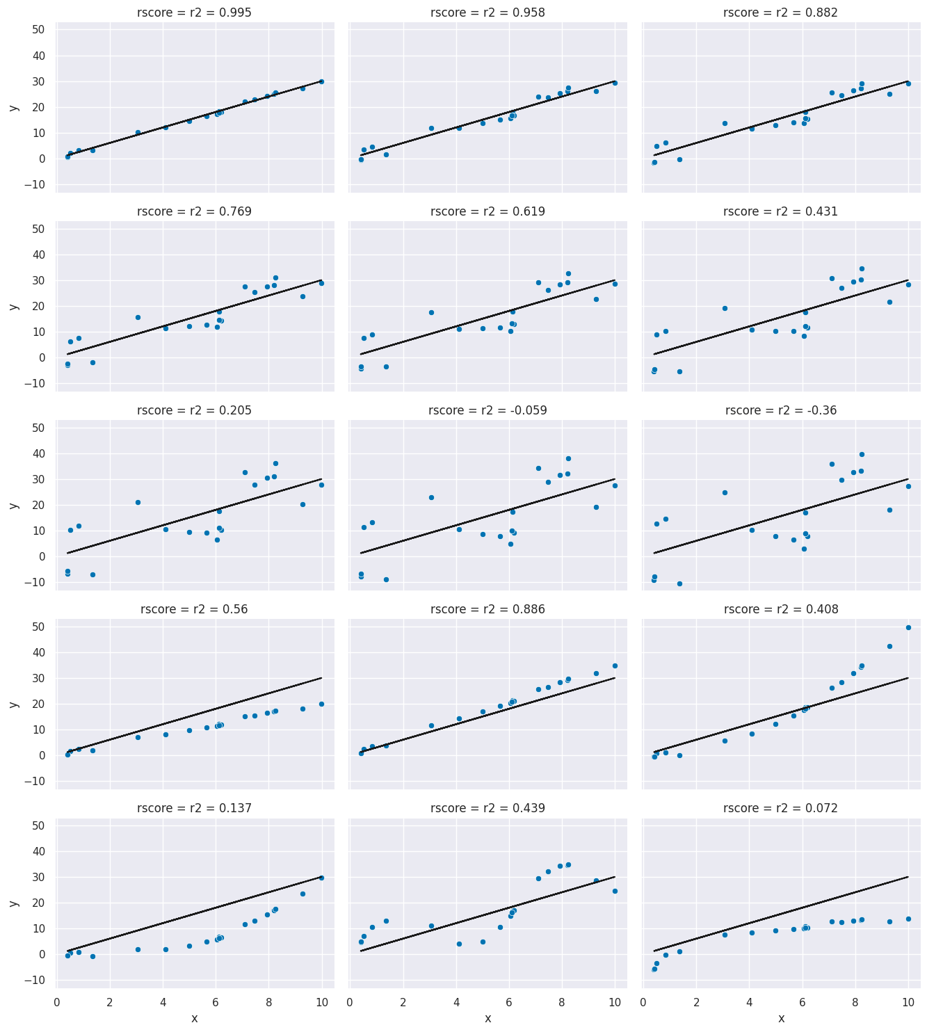
In these, you can see the varying levels of how much the data agrees with te prediction and the corresponding .
Regression auto scoring
as all sklearn objects, it has a built in score method
regr.score(tips_X_test, tips_y_test)0.6151662407996114this matches the score:
r2_score(tips_y_test,tips_y_pred)0.6151662407996114and is different from mse
mean_squared_error(tips_y_test,tips_y_pred)0.7548917933587521tips_df.head()Mutlivariate Regression
Recall the equation for a line:
When we have multiple variables instead of a scalar we can have a vector and instead of a single slope, we have a vector of coefficients
where is the regr_db.coef_ and is regr_db.intercept_ and that’s a vector multiplication and is y_pred and is y_test.
In scalar form, a vector multiplication can be written like
where there are features, that is = len(X_test[k]) and indexed into it.
We can also load data from Scikit learn.
This dataset includes 10 features measured on a given date and an measure of diabetes disease progression measured one year later. The predictor we can train with this data might be someting a doctor uses to calculate a patient’s risk.
diabetes_X, diabetes_y = datasets.load_diabetes(return_X_y = True)This model predicts what lab measure a patient will have one year in the future based on lab measures in a given day. Since we see that this is not a very high r2, we can say that this is not a perfect predictor, but a Doctor, who better understands the score would have to help interpret the core.
diabetes_X[:5]array([[ 0.03807591, 0.05068012, 0.06169621, 0.02187239, -0.0442235 ,
-0.03482076, -0.04340085, -0.00259226, 0.01990749, -0.01764613],
[-0.00188202, -0.04464164, -0.05147406, -0.02632753, -0.00844872,
-0.01916334, 0.07441156, -0.03949338, -0.06833155, -0.09220405],
[ 0.08529891, 0.05068012, 0.04445121, -0.00567042, -0.04559945,
-0.03419447, -0.03235593, -0.00259226, 0.00286131, -0.02593034],
[-0.08906294, -0.04464164, -0.01159501, -0.03665608, 0.01219057,
0.02499059, -0.03603757, 0.03430886, 0.02268774, -0.00936191],
[ 0.00538306, -0.04464164, -0.03638469, 0.02187239, 0.00393485,
0.01559614, 0.00814208, -0.00259226, -0.03198764, -0.04664087]])X_train, X_test, y_train, y_test = train_test_split(diabetes_X, diabetes_y)and fit:
regr_diabetes = linear_model.LinearRegression()
regr_diabetes.fit(X_train, y_train)We can look at the estimator again and see what it learned. It describes the model like a line:
except in this case it’s multivariate, so we can write it like:
where is the regr_db.coef_ and is regr_db.intercept_ and that’s a vector multiplication and is y_pred and is y_test.
In scalar form it can be written like
where there are features, that is = len(X_test[k]) and indexed into it. For example in the below
regr_diabetes.score(X_test, y_test)0.4398366200368361regr_diabetes.__dict__{'fit_intercept': True,
'copy_X': True,
'tol': 1e-06,
'n_jobs': None,
'positive': False,
'n_features_in_': 10,
'coef_': array([ 1.47626742, -212.21879828, 496.54421219, 309.18941732,
-999.79254018, 642.57109399, 214.07104243, 196.01546995,
903.88631916, 64.61894407]),
'rank_': 10,
'singular_': array([1.79107867, 1.06626696, 0.95107638, 0.8284222 , 0.70635296,
0.64793489, 0.62636832, 0.57889582, 0.24435527, 0.0804161 ]),
'intercept_': np.float64(152.42249672120212)}regr.__dict__{'fit_intercept': True,
'copy_X': True,
'tol': 1e-06,
'n_jobs': None,
'positive': False,
'feature_names_in_': array(['total_bill'], dtype=object),
'n_features_in_': 1,
'coef_': array([0.09815895]),
'rank_': 1,
'singular_': array([124.96025915]),
'intercept_': np.float64(1.0005137058456053)}LASSO
To solve a regular linear regression problem and find the weights to make the line:
The fit method find the to minimize the following objective function, for samples, :
Note that this is basically minimizing the mean squared error.
Lasso allows us to pick a subset of the features at the same time we learn the weights
The objective is to minimize:
or in ~python like syntax:
(1 / (2 * n_samples)) * ||y - Xx||^2_2 + alpha * ||w||_1It is implemented as an estimator object like every other one we have seen
lasso = linear_model.Lasso()
lasso.fit(X_train, y_train)
lasso.score(X_test, y_test)0.3086841897481224We see it learns a model with most of the coefficients set to 0.
coefs = lasso.coef_
n_coefs = len(coefs) - sum(coefs==0)
coefs
array([ 0. , 0. , 340.96584924, 0. ,
0. , 0. , -0. , 0. ,
376.02038315, 0. ])we can increase the number of allowed parameters by using making alpha smaller because making smaller allows to be bigger while keeping their product the same which is added to the total predictive error.
lasso = linear_model.Lasso(alpha=.25)
lasso.fit(X_train, y_train)
lasso.score(X_test, y_test)0.40599470563392015coefs = lasso.coef_
n_coefs = len(coefs) - sum(coefs==0)
coefsarray([ 0. , -0. , 486.52545909, 203.04733853,
-0. , -0. , -111.25921734, 0. ,
508.36412386, 0. ])lasso = linear_model.Lasso(alpha=.05)
lasso.fit(X_train, y_train)
lasso.score(X_test, y_test)0.4419539409084168we can compare this to the original score
coefs = lasso.coef_
n_coefs = len(coefs) - sum(coefs==0)
coefs
array([ 0. , -160.23414804, 505.00083491, 284.13759306,
-99.00619029, -0. , -190.52442947, 0. ,
579.72158688, 55.84352092])how could you inspect the residuals with more than one input feature
Let’s get the predictions:
y_pred = regr_diabetes.predict(X_test)One thing we can do is plot the predictions vs the real values, this would ideall be a perfect line
plt.scatter(y_test, y_pred)
plt.plot(y_test,y_test,'k')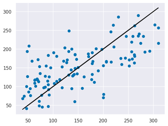
There is some noise as epxected, and further the errors are not uniformly distributed (the black line is the true vs itself) for lower values the model tends to over predict (the predictions are higher than the real value) and for the higher values it tends to underpredict (the predictions are mostly lower than the real value).
We could also plot the residuals similarly:
plt.scatter(y_test, y_test-y_pred)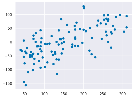
we see the same pattern.
We could also plot the residuals vs the features, to do this, we will make a dataframe and use seaborn. First, we’ll get the feature names.
db_bunch = datasets.load_diabetes()
feature_names = db_bunch.feature_names
Now make a wide dataframe and melt it to be tall
diabetes_residuals_wide = pd.DataFrame(data = X_test, columns =feature_names)
diabetes_residuals_wide['y_pred'] = y_pred
diabetes_residuals_wide['y_test'] = y_test
diabetes_residuals_wide['residual'] = y_test - y_pred

diabetes_residuals = diabetes_residuals_wide.melt(id_vars = ['residual','y_pred','y_test'],
                        value_vars = feature_names, value_name='feature_value', var_name='feature')
diabetes_residuals.head()and now we can make subplot for each figure and plot the residual vs the features
sns.relplot(data = diabetes_residuals, x='feature_value',y = 'residual',
          col='feature',col_wrap=3)
<seaborn.axisgrid.FacetGrid at 0x7f86592e0fe0>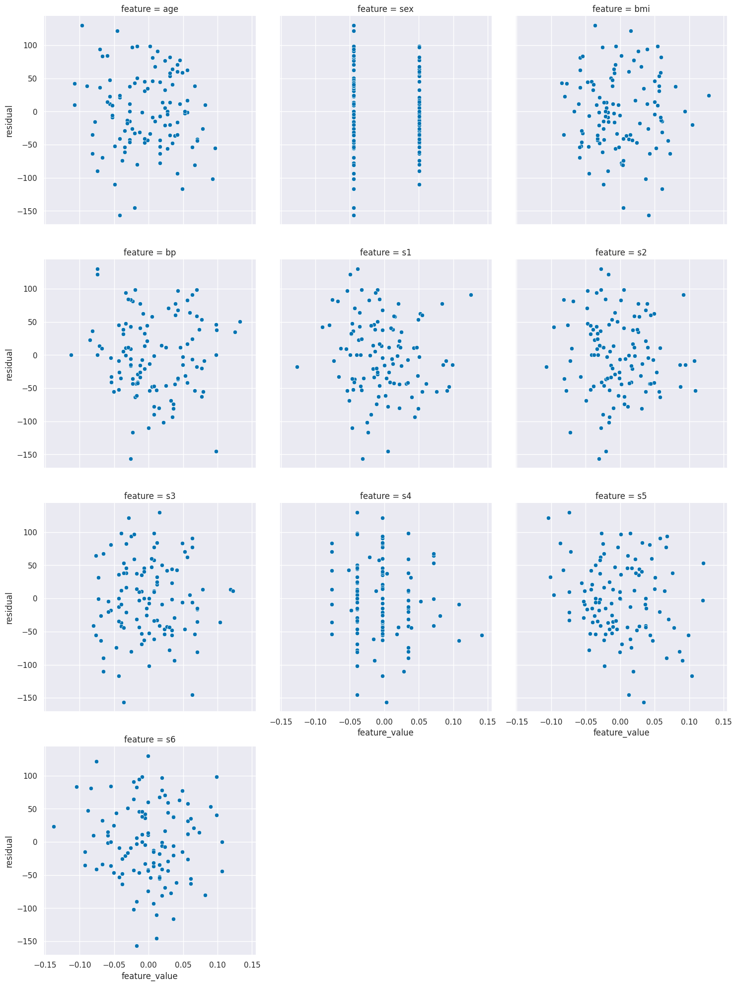
From this, it actually looks like none of the individual features have a lot more information left that we could find.
plt.scatter(tips_y_test, tips_y_test-tips_y_pred)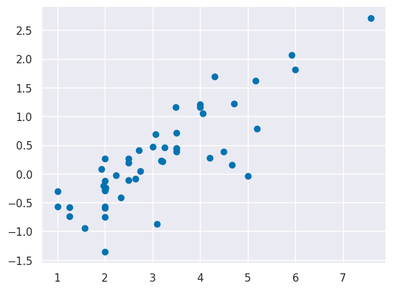
Questions
How does LASSO differ from regular linear regresion?
LASSO is a regularized model.
What is the range of ?
1 is ideal, it would be 0 if the we set the model to always predict y=x.mean() and it can be negative, because it can be arbitrarily bad.