Today, we will see our first machine learning model: Gaussian Naive bayes.
This is a generative classification model
First let’s load the modules and data that we will use today.
import pandas as pd
import seaborn as sns
import numpy as np
from sklearn.model_selection import train_test_split
from sklearn.naive_bayes import GaussianNB
from sklearn.metrics import confusion_matrix, classification_report, roc_auc_score
import matplotlib.pyplot as plt

iris_df = sns.load_dataset('iris')

sns.set_theme(palette='colorblind')
Introduction to the Iris data
We’re trying to build an automatic flower classifier that, for measurements of a new flower returns the predicted species(different types of iris). To do this, we have a DataFrame with columns for species, petal width, petal length, sepal length, and sepal width. The species is what type of flower it is the petal and sepal are parts of the flower.
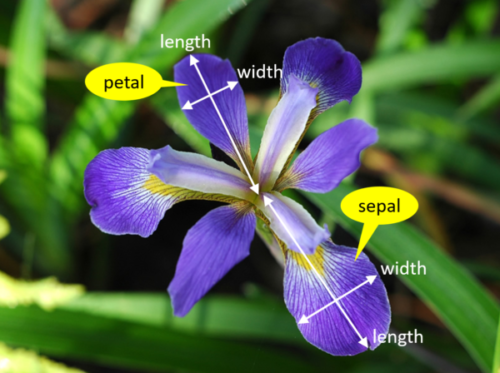
Figure 1:The petal and sepal are different parts of a flower, the popular iris data contains 150 examples of irises from 3 species and 4 measurements of each: petal width, petal length, sepal length and sepal width
iris_df.head()The species will be the target and the 4 measurements will be the features.
For the iris data, our goal is to predict the species from the measurements. To make our code really explicit about how we are using each feature we will make variables for the features and target.
feature_vars = ['sepal_length', 'sepal_width','petal_length', 'petal_width',]
target_var = 'species'
We can look at a few things first:
classes = list(pd.unique(iris_df[target_var]))
iris_df[target_var].value_counts()
species
setosa 50
versicolor 50
virginica 50
Name: count, dtype: int64We see that it has 3 classes: ['setosa', 'versicolor', 'virginica'] and that they all have the same number of samples.
We refer to this as a balanced dataset.
Separating Training and Test Data
To do machine learning, we split the data both sample wise (rows if tidy) and variable-wise (columns if tidy). First, we’ll designate the columns to use as features and as the target.
The features are the input that we wish to use to predict the target.
Next, we’ll use a sklearn function to split the data randomly into test and train portions.
The train_test_split function returns multiple values, the docs say that it returns twice as many as it is passed.
random_state_choice = 5
X_train, X_test, y_train, y_test = train_test_split(iris_df[feature_vars],
                                                    iris_df[target_var],
random_state=random_state_choice)We passed two separate things, the features and the labels separated, so we get train and test each for each:
X_trainis the feature values for training datay_trainis the target values for training data
We can look at the training data’s head:
X_train.head()and the test data
X_test.head()we see that they have different heads but the same columns. Let’s look at their sizes:
full_r, _ = iris_df.shape
train_r, train_c = X_train.shape
test_r, test_c = X_test.shape
full_r, train_r, test_r
(150, 112, 38)We see the total data has 150 rows and then 112 will be used for training and 38 for test
these add up:
full_r == train_r + test_rTrueand by default the percentage of training data
train_pct = train_r/full_r
train_pct0.7466666666666667We see by default it is 74.66666666666667%
What does Gaussian Naive Bayes do?
Gaussian Naive Bayes is a classification model that assumes:
Gaussian = the data is distributed
Naive = indepedent (uncorrelated/near 0 correlation) features (see: Correlation)
Bayes = most probable class is the right one to predict
More resources:
We can look at this data using a pair plot. It plots each pair of numerical variables in a grid of scatterplots and on the diagonal (where it would be a variable with itself) shows the distribution of that variable (with a kdeplot).
sns.pairplot(iris_df,hue='species')<seaborn.axisgrid.PairGrid at 0x7f2035015a00>
This data is reasonably separable beacause the different species (indicated with colors in the plot) do not overlap much. All classifiers require separable classes.
We see that the features are distributed sort of like a normal, or Gaussian, distribution. In 1D this is the familiar bell curve. In 2D a Gaussian distribution is like a hill, so we expect to see more points near the center and fewer on the edge of circle-ish blobs. These blobs are slightly like ovals, but not too skew(diagonal).
This means that the assumptions of the Gaussian Naive Bayes model are met well enough we can expect the classifier to do well.
Instantiating our Model Object
Next we will instantiate the object for our model. In sklearn they call these objects estimator. All estimators have a similar usage. First we instantiate the object and set any hyperparameters.
Instantiating the object says we are assuming a particular type of model. In this case Gaussian Naive Bayes.
GaussianNB sets several assumptions in one form:
we assume data are Gaussian (normally) distributed
the features are uncorrelated/independent (Naive)
the best way to predict is to find the highest probability (Bayes)
this is one example of a Bayes Estimator
gnb = GaussianNB()At this point the object is not very interesting, but we can still inspect it so we can see a before and after
gnb.__dict__{'priors': None, 'var_smoothing': 1e-09}Fitting the model to the data
The fit method uses the data to learn the model’s parameters, it implements the learning algorithm. In this case, a Gaussian distribution is characterized by a mean and variance; so the GNB classifier is characterized by one mean and one variance for each class (in 4d, like our data).
gnb.fit(X_train, y_train)The attributes of the estimator object (gbn) describe the data (eg the class list) and the model’s parameters. The theta_ (often in math as or )
represents the mean and the var_ () represents the variance of the
distributions.
gnb.__dict__{'priors': None,
'var_smoothing': 1e-09,
'classes_': array(['setosa', 'versicolor', 'virginica'], dtype='<U10'),
'feature_names_in_': array(['sepal_length', 'sepal_width', 'petal_length', 'petal_width'],
dtype=object),
'n_features_in_': 4,
'epsilon_': np.float64(3.1373206313775512e-09),
'theta_': array([[5.00526316, 3.45263158, 1.45 , 0.23421053],
[5.96666667, 2.75277778, 4.26666667, 1.31944444],
[6.55789474, 2.98684211, 5.52105263, 2.02631579]]),
'var_': array([[0.14207757, 0.16196676, 0.03460527, 0.00698754],
[0.26611111, 0.10471451, 0.21722223, 0.03767747],
[0.40770083, 0.1090374 , 0.32745153, 0.06193906]]),
'class_count_': array([38., 36., 38.]),
'class_prior_': array([0.33928571, 0.32142857, 0.33928571])}We can see it learned a bunch about our data.
The theta_ is the means of the distribution and the var_ is the variance.
Scoring a model
Estimator objects also have a score method. If the estimator is a classifier, that score is accuracy. We will see that for other types of estimators it is different types.
gnb.score(X_test,y_test)0.9210526315789473Making model predictions
we can predict for each sample as well:
y_pred = gnb.predict(X_test)
y_pred
array(['versicolor', 'versicolor', 'virginica', 'setosa', 'virginica',
'versicolor', 'setosa', 'virginica', 'setosa', 'versicolor',
'versicolor', 'versicolor', 'virginica', 'virginica', 'setosa',
'setosa', 'virginica', 'virginica', 'setosa', 'setosa',
'versicolor', 'virginica', 'setosa', 'versicolor', 'versicolor',
'virginica', 'versicolor', 'versicolor', 'versicolor', 'virginica',
'setosa', 'versicolor', 'versicolor', 'setosa', 'versicolor',
'setosa', 'setosa', 'virginica'], dtype='<U10')We can also do one single sample, the iloc attrbiute lets us pick out rows by
integer index even if that is not the actual index of the DataFrame
X_test.iloc[0]sepal_length 5.8
sepal_width 2.7
petal_length 3.9
petal_width 1.2
Name: 82, dtype: float64but if we pick one row, it returns a series, which is incompatible with the predict method.
gnb.predict(X_test.iloc[0])/home/runner/.local/lib/python3.12/site-packages/sklearn/utils/validation.py:2691: UserWarning: X does not have valid feature names, but GaussianNB was fitted with feature names
warnings.warn(
---------------------------------------------------------------------------
ValueError                                Traceback (most recent call last)
Cell In[19], line 1
----> 1 gnb.predict(X_test.iloc[0])

File ~/.local/lib/python3.12/site-packages/sklearn/naive_bayes.py:112, in _BaseNB.predict(self, X)
    110 check_is_fitted(self)
    111 xp, _ = get_namespace(X)
--> 112 X = self._check_X(X)
    113 jll = self._joint_log_likelihood(X)
    114 pred_indices = xp.argmax(jll, axis=1)

File ~/.local/lib/python3.12/site-packages/sklearn/naive_bayes.py:285, in GaussianNB._check_X(self, X)
    283 def _check_X(self, X):
    284     """Validate X, used only in predict* methods."""
--> 285     return validate_data(self, X, reset=False)

File ~/.local/lib/python3.12/site-packages/sklearn/utils/validation.py:2902, in validate_data(_estimator, X, y, reset, validate_separately, skip_check_array, **check_params)
   2900         out = X, y
   2901 elif not no_val_X and no_val_y:
-> 2902     out = check_array(X, input_name="X", **check_params)
   2903 elif no_val_X and not no_val_y:
   2904     out = _check_y(y, **check_params)

File ~/.local/lib/python3.12/site-packages/sklearn/utils/validation.py:1060, in check_array(array, accept_sparse, accept_large_sparse, dtype, order, copy, force_writeable, ensure_all_finite, ensure_non_negative, ensure_2d, allow_nd, ensure_min_samples, ensure_min_features, estimator, input_name)
   1053         else:
   1054             msg = (
   1055                 f"Expected 2D array, got 1D array instead:\narray={array}.\n"
   1056                 "Reshape your data either using array.reshape(-1, 1) if "
   1057                 "your data has a single feature or array.reshape(1, -1) "
   1058                 "if it contains a single sample."
   1059             )
-> 1060         raise ValueError(msg)
   1062 if dtype_numeric and hasattr(array.dtype, "kind") and array.dtype.kind in "USV":
   1063     raise ValueError(
   1064         "dtype='numeric' is not compatible with arrays of bytes/strings."
   1065         "Convert your data to numeric values explicitly instead."
   1066     )

ValueError: Expected a 2-dimensional container but got <class 'pandas.core.series.Series'> instead. Pass a DataFrame containing a single row (i.e. single sample) or a single column (i.e. single feature) instead.
If we select with a range, that only includes 1, it still returns a DataFrame
X_test.iloc[0:1]which we can get a prediction for:
gnb.predict(X_test.iloc[0:1])array(['versicolor'], dtype='<U10')We could also transform with to_frame and then transpose with T or (transpose)
gnb.predict(X_test.iloc[0].to_frame().T)array(['versicolor'], dtype='<U10')We can also pass a 2D array (list of lists) with values in it (here I typed in values similar to the mean for setosa above, so it should predict setosa)
gnb.predict([[5.1, 3.6, 1.5, 0.25]])/home/runner/.local/lib/python3.12/site-packages/sklearn/utils/validation.py:2691: UserWarning: X does not have valid feature names, but GaussianNB was fitted with feature names
warnings.warn(
array(['setosa'], dtype='<U10')This way it warns us that the feature names are missing, but it still gives a prediction.
More evaluation
Like we saw last week, we can also produce a confusion matrix for this problem. This time however it will be 3x3 since we have 3 classes: ['setosa', 'versicolor', 'virginica']
confusion_matrix(y_test,y_pred)array([[12, 0, 0],
[ 0, 13, 1],
[ 0, 2, 10]])This is a little harder to read than the 2D version but we can make it a dataframe to read it better.
n_classes = len(gnb.classes_)
prediction_labels = [['predicted class']*n_classes, gnb.classes_]
actual_labels = [['true class']*n_classes, gnb.classes_]
conf_mat = confusion_matrix(y_test,y_pred)
conf_df = pd.DataFrame(data = conf_mat, index=actual_labels, columns=prediction_labels)
conf_dfWe see that the setosa is never mistaken for other classes but he other two are mixed up a few times.
A summary “report” is also available:
print(classification_report(y_test,y_pred)) precision recall f1-score support
setosa 1.00 1.00 1.00 12
versicolor 0.87 0.93 0.90 14
virginica 0.91 0.83 0.87 12
accuracy 0.92 38
macro avg 0.93 0.92 0.92 38
weighted avg 0.92 0.92 0.92 38
We can also get a report with a few metrics.
Recall is the percent of each species that were predicted correctly.
Precision is the percent of the ones predicted to be in a species that are truly that species.
the F1 score is combination of the two
We see we have perfect recall and precision for setosa, as above, but we have lower for the other two because there were mistakes where versicolor and virginica were mixed up.
How does GNB make predictions?
Recall the original assumptions. We can see the third one (predicting most probable class) by looking at, for each test sample the probability it belongs to each class.
For two sample we get a probability for each class:
gnb.predict_proba(X_test.iloc[0:2])array([[4.98983163e-068, 9.99976886e-001, 2.31140535e-005],
[2.38605399e-151, 6.05788555e-001, 3.94211445e-001]])We can visualize these by making a dataframe and plotting it.
First we make the dataframe with the probabilities, the true values and the predictions.
Notebook Cell
# make the probabilities into a dataframe labeled with classes & make the index a separate column
prob_df = pd.DataFrame(data = gnb.predict_proba(X_test), columns = gnb.classes_ ).reset_index()
# add the predictions as a new column
prob_df['predicted_species'] = y_pred
# add the true species as a new column
prob_df['true_species'] = y_test.values
prob_df.head()Then add some additional columns
Notebook Cell
# for plotting, make a column that combines the index & prediction
pred_text = lambda r: str( r['index']) + ',' + r['predicted_species']
prob_df['i,pred'] = prob_df.apply(pred_text,axis=1)
# same for ground truth
true_text = lambda r: str( r['index']) + ',' + r['true_species']
prob_df['i,true'] = prob_df.apply(true_text,axis=1)
# a dd a column for which are correct
prob_df['correct'] = prob_df['predicted_species'] == prob_df['true_species']
prob_df.head()Finally we melt the data to use it for plotting
Notebook Cell
prob_df_melted = prob_df.melt(id_vars =[ 'index', 'predicted_species','true_species','i,pred','i,true','correct'],value_vars = gnb.classes_,
                             var_name = target_var, value_name = 'probability')
prob_df_melted.head()sns.set_theme(font_scale=2)
sns.catplot(data =prob_df_melted, x = 'species', y='probability' ,col ='i,true',
col_wrap=5,kind='bar', hue='species')<seaborn.axisgrid.FacetGrid at 0x7f2032130da0>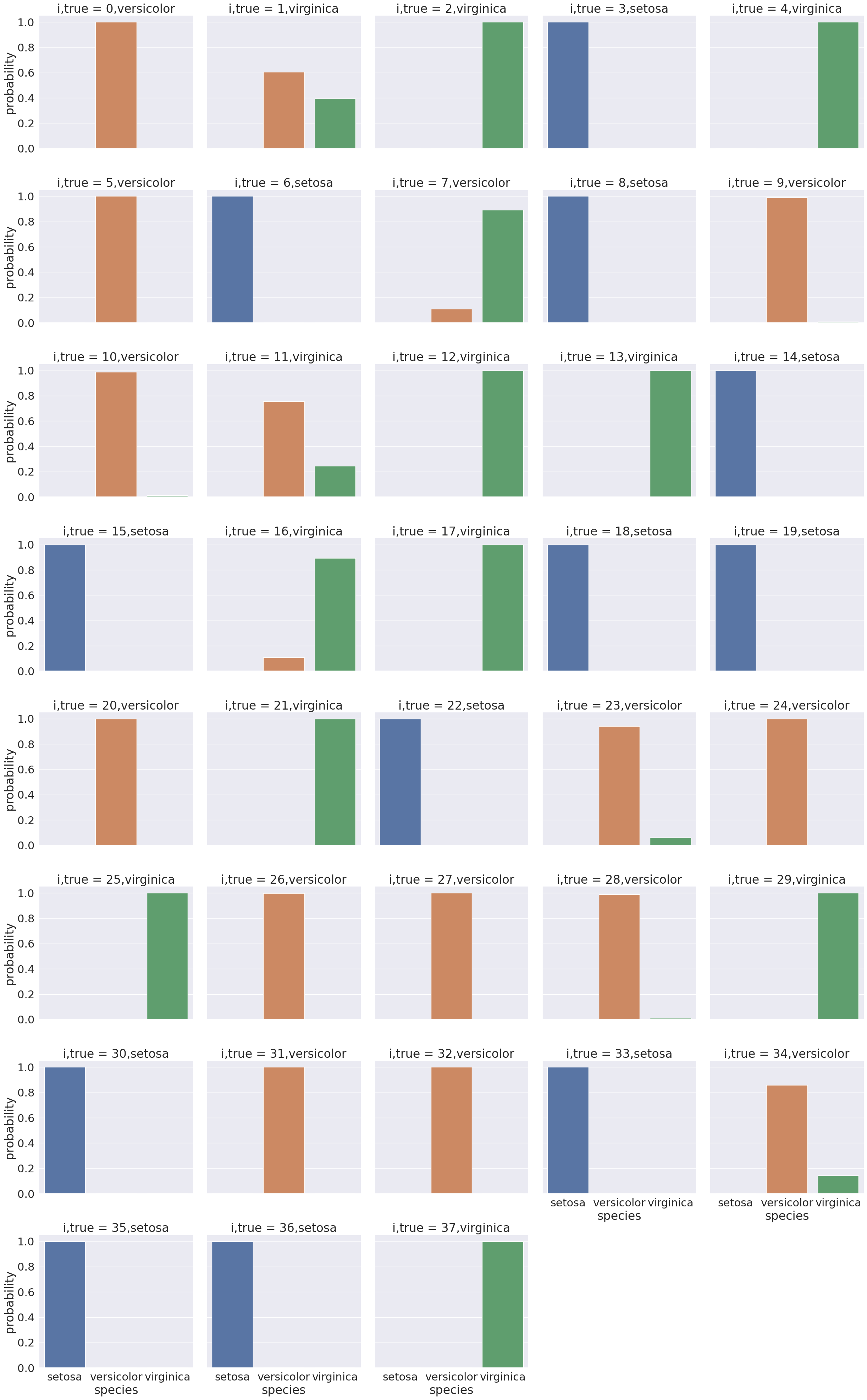
Here we see for each point in the test set a bar for the model’s probability that it belongs to each of the 3 classes(['setosa', 'versicolor', 'virginica']).
Most points are nearly probability 1 in the correvt class and near 0 in the other classes.
For example:
prob_select_idx = prob_df_melted['index'].isin([0,2,3])
sns.catplot(data =prob_df_melted[prob_select_idx], x = 'species',
    y='probability' ,col ='i,true',
            col_wrap=5,kind='bar', hue='species')
<seaborn.axisgrid.FacetGrid at 0x7f20273c4530>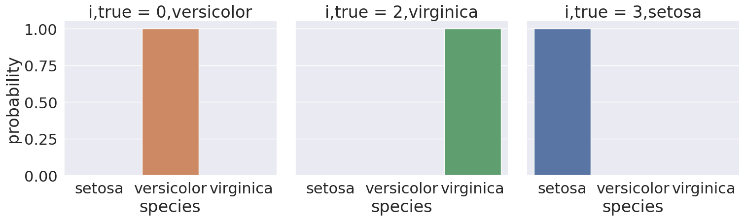
Some, however, are less clear cut, for exmple, sample 1
split = [1]
prob_select_idx = prob_df_melted['index'].isin(split)

sns.catplot(data =prob_df_melted[prob_select_idx], x = 'species',
    y='probability' ,col ='i,true',
            col_wrap=5,kind='bar', hue='species')
<seaborn.axisgrid.FacetGrid at 0x7f2027332ea0>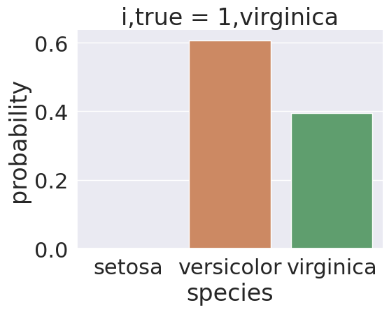
Sample 1’s true class is virginica, but it was predicted as np.str_('versicolor'). We see in the plot, the model was actually split on this sample, 2 bars are meaningfully above 0.
We could even pick out all of the ones where the predictionw as wrong:
error_idx = prob_df_melted['correct'] ==False

sns.catplot(data =prob_df_melted[error_idx], x = 'species',
    y='probability' ,col ='i,true',
            col_wrap=5,kind='bar', hue='species')
<seaborn.axisgrid.FacetGrid at 0x7f202969b9b0>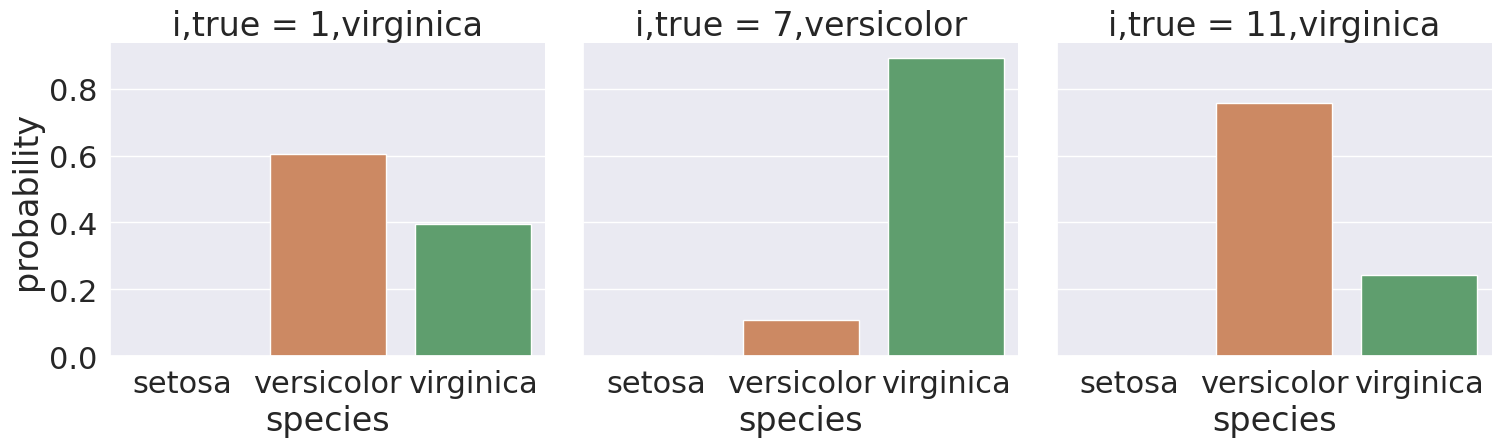
All of these have a somewhat split decision, so that is good, the model was not confidently wrong.
What does it mean to be a generative model?
Gaussian Naive Bayes is a very simple model, but it is a generative model (in constrast to a discriminative model) so we can use it to generate synthetic data that looks like the real data, based on what the model learned.
sns.set_theme(font_scale=1)
N = 50
gnb_df = pd.DataFrame(np.concatenate([np.random.multivariate_normal(th, sig*np.eye(4),N)
                 for th, sig in zip(gnb.theta_,gnb.var_)]),
                 columns = gnb.feature_names_in_)
gnb_df['species'] = [ci for cl in [[c]*N for c in gnb.classes_] for ci in cl]
gnb_df.head()To break this code down:
we extract the mean and variance parameters from the model (
gnb.theta_,gnb.var_)then
zipthem together to create an iterable object that in each iteration returns one value from each list (for th, sig in zip(gnb.theta_,gnb.var_))we build a list comprehension (
[])so that
this fromgnb.theta_andsigis fromgnb.var_we use
np.random.multivariate_normalto getN=50 samples. We can change this to anything, but I chose 50 beacuse the original data also had 50 samples per class.to create the matrix from the vector of variances we multiply by
np.eye(4)which is the identity matrix or a matrix with 1 on the diagonal and 0 elsewhere. because in a general multivariate normal distribution the second parameter is actually a covariance matrix. This describes both the variance of each individual feature and the correlation of the features. Since Gaussian Naive Bayes is Naive it assumes the features are independent or have 0 correlation, so only the diagonal is nonzero.stack the groups for each species together with
np.concatenate(likepd.concatbut works on numpy objects andnp.random.multivariate_normalreturns numpy arrays not data frames)put all of that in a DataFrame using the feature names as the columns.
add a species column, by repeating each species 20 times
[c]*N for c in gnb.classes_and then unpack that into a single list instead of as list of lists.
Now that we have simulated data (also known as synthetic) that represents our what our model knows, we can plot it the same way we plotted the actual iris data.
sns.pairplot(data =gnb_df, hue='species')<seaborn.axisgrid.PairGrid at 0x7f203212bb30>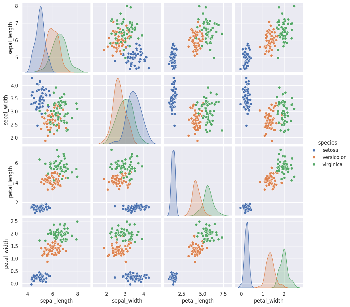
These look pretty similar.
To help compare visually here they are in tabs so you can toggle back and forth.
sns.pairplot(iris_df,hue='species')<seaborn.axisgrid.PairGrid at 0x7f2035015a00>sns.pairplot(data =gnb_df, hue='species')<seaborn.axisgrid.PairGrid at 0x7f203212bb30>Think Ahead
Does this data meet the assumptions of Gaussian Naive Bayes?
corner_data = 'https://raw.githubusercontent.com/rhodyprog4ds/06-naive-bayes/f425ba121cc0c4dd8bcaa7ebb2ff0b40b0b03bff/data/dataset6.csv'
df6= pd.read_csv(corner_data,usecols=[1,2,3])
sns.pairplot(data=df6, hue='char',hue_order=['A','B'])
<seaborn.axisgrid.PairGrid at 0x7f2028a2ab40>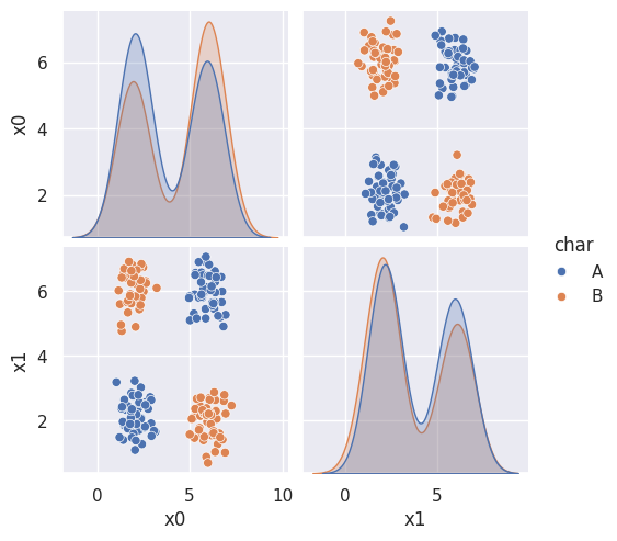
Questions
Why some of our numbers were different than yours?
The train_test_split function is random, so each time it is run it will give different results, unless the random_state is set so that it uses a particular sequence of psuedo-random numbers.
is species as in what type of flower it is?
yes
what is X_train and y_train doing?
The original data had 5 columns
iris_df.head()Since we will do classification which is supervised learning, the training data has two parts: the features and targets
X is only the feature columns, here ['sepal_length', 'sepal_width', 'petal_length', 'petal_width']
X_train.head()y is only the target column, here species:
y_train.head()40 setosa
115 virginica
142 virginica
69 versicolor
17 setosa
Name: species, dtype: objectWe can see that these have the same rows selected.
We can also confirm that these are different rows from the test data
np.sum([xti in X_test.index for xti in X_train.index])np.int64(0)Since the above came out to 0, we know tht for every element of X_train.index it does not appear in X_test.index
I would like to know more about making model predictions
We will be doing more of this over the next few classes!
What are the different names for parameters within GNB?
The Gausian Naive Bayes classifier has two main model parameters the mean and variance as a Gaussian Distribution does. There are a few others, you can read about in the docs, but are not required.
What is np.eye() what does that mean and why use 4?
np.eye(D) creates an Identity matrix of dimension D. We used 4 because there are 4 features (['sepal_length', 'sepal_width', 'petal_length', 'petal_width']) in the data.
np.eye(4)array([[1., 0., 0., 0.],
[0., 1., 0., 0.],
[0., 0., 1., 0.],
[0., 0., 0., 1.]])do we only open 1 pull request for assignment 3?
Yes
How much can classes overlap before it becomes an issue?
The classes have to be separable to get a perfect classification, if they’re not perfectly separable, then the classifier will make errors. The answer to this question depends on the cost of an error.
For the current split (with random_state 5) we got a good, but not perfect score
The test set here must overlap a little:
test_df = X_test
test_df['species'] = y_test
sns.pairplot(test_df,hue='species')
<seaborn.axisgrid.PairGrid at 0x7f2028472e10>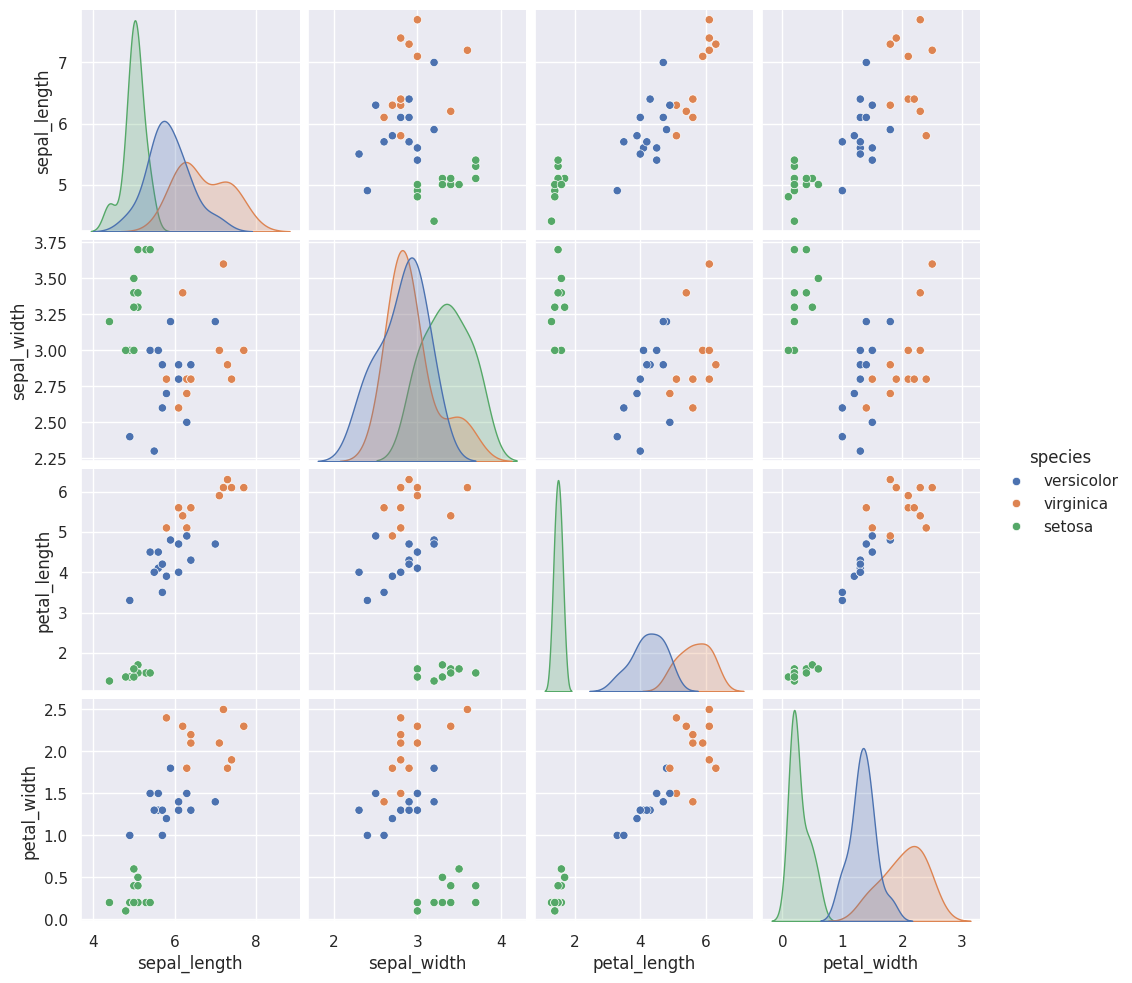
If you look in the petal_width vs petal_length sub plots there are some points that almost completly overlap.
Remember, when we had random_state=0, we got a perfect score. Let’s do that again:
X_train0, X_test0, y_train0, y_test0 = train_test_split(iris_df[feature_vars],
                                                    iris_df[target_var],
                                                    random_state=0)
gnb.fit(X_train0,y_train0).score(X_test0,y_test0)1.0This then has no overlap.
test_df = X_test0
test_df['species'] = y_test0
sns.pairplot(test_df,hue='species')
<seaborn.axisgrid.PairGrid at 0x7f2027f5e720>