Clustering is unsupervised learning. That means we do not have the labels to learn from. We aim to learn both the labels for each point and some way of characterizing the classes at the same time.
Computationally, this is a harder problem. Mathematically, we can typically solve problems when we have a number of equations equal to or greater than the number of unknowns. For data points in dimensions and clusters, we have equations and unknowns:
1 unknown label for each sample ()
unknown means (each a vector of size )
In contrast, in Gaussian Naive Bayes, we our unknowns would be for classes and features:
unknown means (each a vector of size )
unknown variances (each a vector of size )
This means we have a harder problem to solve.
For today, we’ll see K-means clustering which is defined by a number of clusters and a mean (center) for each one. There are other K-centers algorithms for other types of centers.
Clustering is, generally, a stochastic (random) algorithm, so it can be a little harder to debug the models and measure performance. For this reason, we are going to look a little more closely at what it actually does than we did with classification.
Today we will focus on the assumptions and measuring performance.
KMeans
clustering goal: find groups of samples that are similar
k-means assumption: a fixed number () of means will describe the data enough to find the groups
Clustering with Sci-kit Learn
import seaborn as sns
import numpy as np
from sklearn import datasets
from sklearn.cluster import KMeans
from sklearn import metrics
import pandas as pd
import matplotlib.pyplot as plt
sns.set_theme(palette='colorblind')

# set global random seed so that the notes are the same each time the site builds
np.random.seed(1103)
np.random.seed(113)
Today we will load the iris data from seaborn:
iris_df = sns.load_dataset('iris')this is how the clustering algorithm sees the data, with no labels:
sns.pairplot(iris_df)<seaborn.axisgrid.PairGrid at 0x7fe861b9cdd0>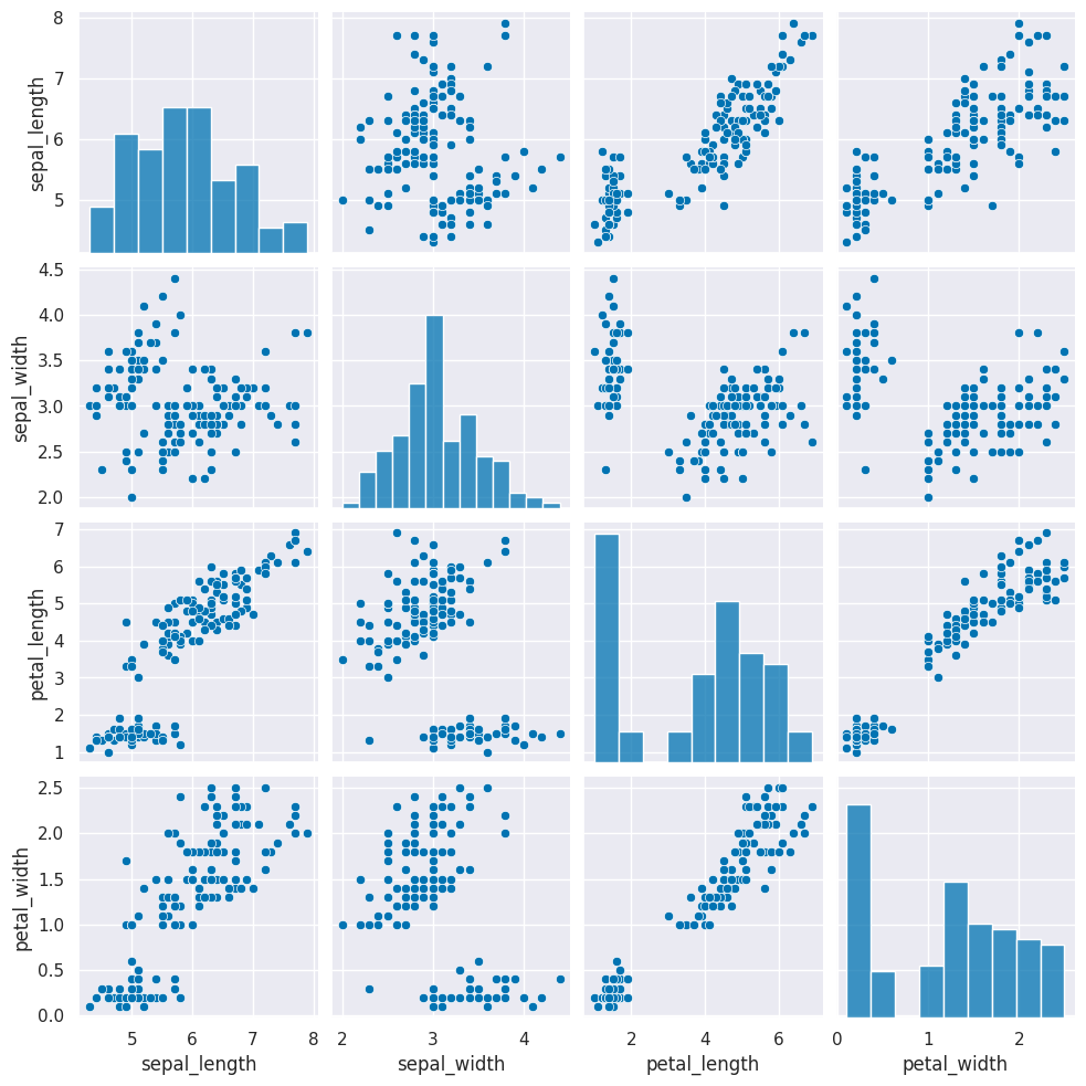
Next we need to create a copy of the data that’s appropriate for clustering. Remember that clustering is unsupervised learning so it doesn’t have a target variable. We also can do clustering on the data with or without splitting into test/train splits, since it doesn’t use a target variable, we can evaluate how good the clusters it finds are on the actual data that it learned from.
We can either pick the measurements out or drop the species column. remember most data frame operations return a copy of the dataframe.
We will drop here:
iris_X = iris_df.drop(columns=['species'])and inspect to see it:
iris_X.head()Next, we create a Kmeans estimator object with 3 clusters, since we know that the iris data has 3 species of flowers.
km = KMeans(n_clusters=3)We dropped the column that tells us which of the three classes that each sample(row) belongs to. We still have data from three species of flowers, so we still expect to find 3 clusters.
Again, we will inspect the object to see the before and after
km.__dict__{'n_clusters': 3,
'init': 'k-means++',
'max_iter': 300,
'tol': 0.0001,
'n_init': 'auto',
'verbose': 0,
'random_state': None,
'copy_x': True,
'algorithm': 'lloyd'}We can use fit again, but this time it only requires the features, no labels.
km.fit(iris_X)and after fitting, we can see what it learned (and compare to before)
We see it learns similar, but fewer, parameters compared to gnb:
km.__dict__{'n_clusters': 3,
'init': 'k-means++',
'max_iter': 300,
'tol': 0.0001,
'n_init': 'auto',
'verbose': 0,
'random_state': None,
'copy_x': True,
'algorithm': 'lloyd',
'feature_names_in_': array(['sepal_length', 'sepal_width', 'petal_length', 'petal_width'],
dtype=object),
'n_features_in_': 4,
'_tol': np.float64(0.00011356176666666667),
'_n_init': 1,
'_algorithm': 'lloyd',
'_n_threads': 2,
'cluster_centers_': array([[5.9016129 , 2.7483871 , 4.39354839, 1.43387097],
[5.006 , 3.428 , 1.462 , 0.246 ],
[6.85 , 3.07368421, 5.74210526, 2.07105263]]),
'_n_features_out': 3,
'labels_': array([1, 1, 1, 1, 1, 1, 1, 1, 1, 1, 1, 1, 1, 1, 1, 1, 1, 1, 1, 1, 1, 1,
1, 1, 1, 1, 1, 1, 1, 1, 1, 1, 1, 1, 1, 1, 1, 1, 1, 1, 1, 1, 1, 1,
1, 1, 1, 1, 1, 1, 0, 0, 2, 0, 0, 0, 0, 0, 0, 0, 0, 0, 0, 0, 0, 0,
0, 0, 0, 0, 0, 0, 0, 0, 0, 0, 0, 2, 0, 0, 0, 0, 0, 0, 0, 0, 0, 0,
0, 0, 0, 0, 0, 0, 0, 0, 0, 0, 0, 0, 2, 0, 2, 2, 2, 2, 0, 2, 2, 2,
2, 2, 2, 0, 0, 2, 2, 2, 2, 0, 2, 0, 2, 0, 2, 2, 0, 0, 2, 2, 2, 2,
2, 0, 2, 2, 2, 2, 0, 2, 2, 2, 0, 2, 2, 2, 0, 2, 2, 0], dtype=int32),
'inertia_': 78.851441426146,
'n_iter_': 6}Visualizing the outputs
First we’ll save it in the dataframe, then we will plot it like we have before, but this time we will use the predicted values for the hue.
iris_df['km3'] = km.predict(iris_X).astype(str)
sns.pairplot(iris_df, hue='km3')
<seaborn.axisgrid.PairGrid at 0x7fe8b412be90>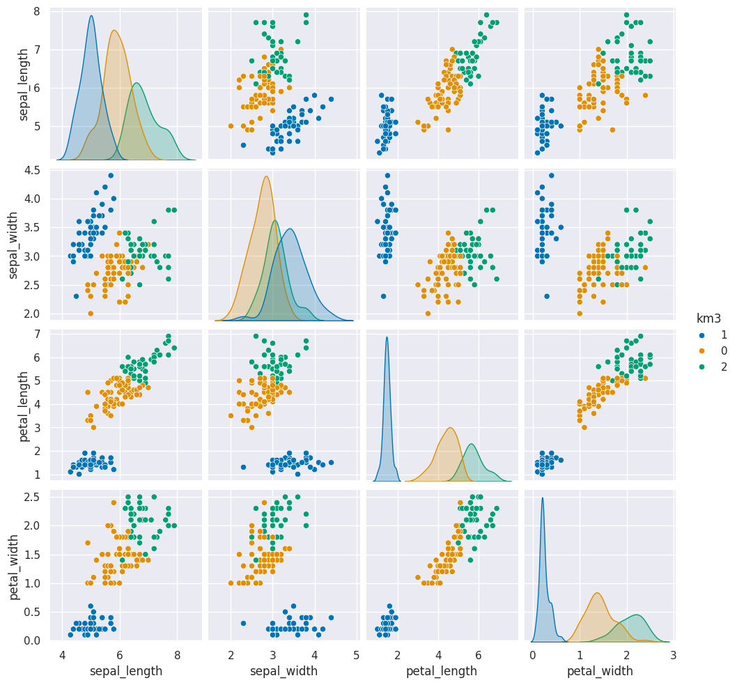
For one pair of features we can look in more detail:
sns.relplot(data=iris_df,x = 'petal_width',y='sepal_width',
                hue='km3',style='species')
<seaborn.axisgrid.FacetGrid at 0x7fe85949c0e0>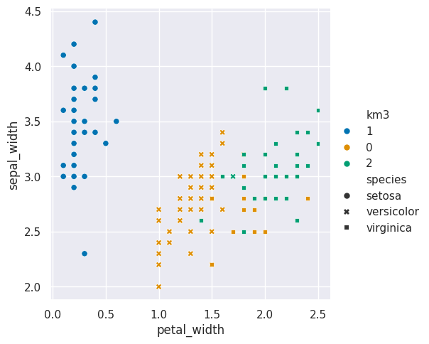
here I used the style to set the shape and the hue to set th color of the markers
so that we can see where the ground truth and learned groups agree and disagree.
Randomness in Kmeans
If we run that a few times, we will see different solutions each time because the algorithm is random, or stochastic.
for i in range(5):
    iris_df['km3_'+str(i)] = km.fit_predict(iris_X)
Since we don’t have separate test and train data, we can use the fit_predict method. This is what the kmeans algorithm always does anyway, it both learns the means and the assignment (or prediction) for each sample at the same time.
Flip through these tabs and notice that the points stay in approximately the same clusters or that the partition is the same but the labels (0,1,2) assigned to each group changes (the colors change from solution to solution)
sns.pairplot(iris_df, vars=iris_X.columns,hue='km3_0')<seaborn.axisgrid.PairGrid at 0x7fe859528050>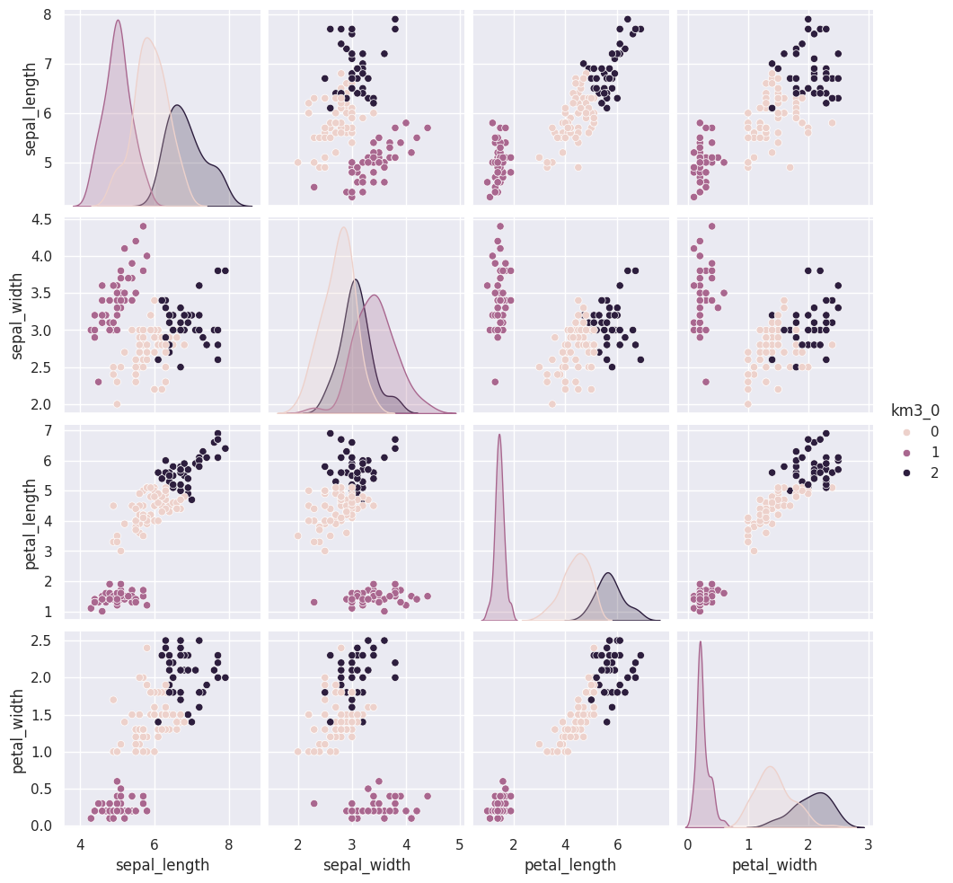
sns.pairplot(iris_df, vars=iris_X.columns,hue='km3_1')<seaborn.axisgrid.PairGrid at 0x7fe8590801d0>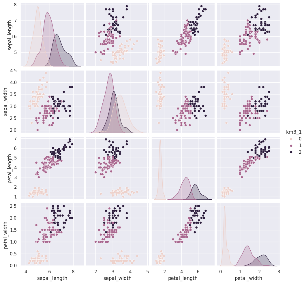
sns.pairplot(iris_df, vars=iris_X.columns,hue='km3_2')<seaborn.axisgrid.PairGrid at 0x7fe8588e81d0>
sns.pairplot(iris_df, vars=iris_X.columns,hue='km3_3')<seaborn.axisgrid.PairGrid at 0x7fe857d373b0>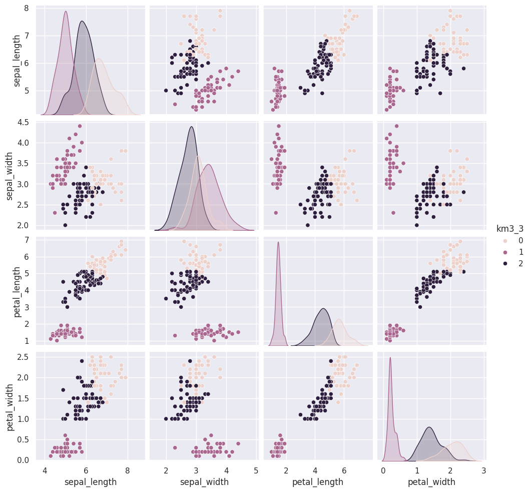
sns.pairplot(iris_df, vars=iris_X.columns,hue='km3_4')<seaborn.axisgrid.PairGrid at 0x7fe857920d40>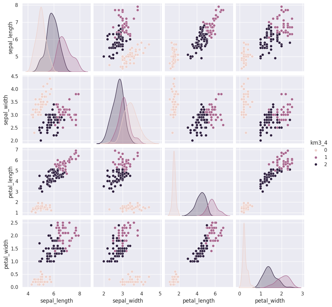
Solution to Exercise 1
Since the column passed to hue ('km3') is numerical, it uses a continuous color palette instead of discrete one.
You can change the palette and to force it to be discrete you can cast the column.
These are similar to the outputs in classification, except that in classification, it’s able to tell us a specific species for each. Here it can only say clust 0, 1, or 2. It can’t match those groups to the species of flower.
Clustering Evaluations
We cannot compute the same metrics we used for classification for clustering, because since it is unsupervised learning
Silhouette Score
The silhouette score captures how compact and separate the clusters are
Can't use function '$' in math mode at position 25: …{b-a}{max(a,b)}$̲$

s = \frac{b-a}{max(a,b)}$$
a: The mean distance between a sample and all other points in the same class.
b: The mean distance between a sample and all other points in the next nearest cluster.
These labels are randomly assigned to data that comes from a single Gaussian distribution.
Source
N = 100
# sample data that is one blob, in 2dimensions
bad_cluster_data = np.random.multivariate_normal([5,5],.75*np.eye(2), size=N)
data_cols = ['x0','x1']
df = pd.DataFrame(data=bad_cluster_data,columns=data_cols)
# randomly assign cluster labels with equal 50-50 probabilty for each sample
df['cluster'] = np.random.choice([0,1],N)

sns.relplot(data=df,x='x0',y='x1',hue='cluster',)
plt.title('S = ' + str(metrics.silhouette_score(df[data_cols],df['cluster'])));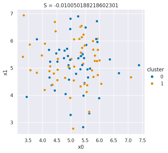
These labels are used to actually generate data for very compact clusters that are far apart.
Source
N = 50
# spread is how far apart the points are within each cluster
#  (related to a)
spread = .05
# distance is how far apart the clusters are (realted to b)
distance = 50
# sample one cluster
single_cluster = np.random.multivariate_normal([1,1],
                                                spread*np.eye(2),
                                                 size=N)
#  make 2 copies, with a constant distance between them
good_cluster_data = np.concatenate([single_cluster,distance+single_cluster])
data_cols = ['x0','x1']
df = pd.DataFrame(data=good_cluster_data,columns=data_cols)
# label the points, since they're in order
df['cluster'] = [0]*N + [1]*N

sns.relplot(data=df,x='x0',y='x1',hue='cluster',)
plt.title('S = ' + str(metrics.silhouette_score(df[data_cols],df['cluster'])));
Mutual Information
Mutual information scores can be used to either compare a clustering solution to the real labels (the actual flower species for the iris data) or to compare two different clusterings to see if they are consistent.
In the plots below the color of the points represents one solution and the symbol represents the other.
Both the color and symbol are randomly assigned to data that comes from a single Gaussian distribution.
Source
N = 100
# sample data that is one blob, in 2dimensions
bad_cluster_data = np.random.multivariate_normal([5,5],.75*np.eye(2), size=N)
data_cols = ['x0','x1']
df = pd.DataFrame(data=bad_cluster_data,columns=data_cols)
# randomly assign cluster labels with equal 50-50 probabilty for each sample
colors = ['blue','orange']
symbols = ['o','x']
df['color'] = np.random.choice(colors,N)
df['symbol'] = np.random.choice(symbols,N)

sns.relplot(data=df,x='x0',y='x1',hue='color',style='symbol',hue_order = colors,style_order =symbols)
plt.title('S = ' + str(metrics.adjusted_mutual_info_score(df['color'],df['symbol'])));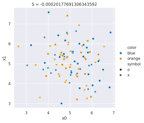
These labels are used to actually generate data for very compact clusters that are far apart and the color and the symbol are the same.
Source
N = 50
# spread is how far apart the points are within each cluster
#  (related to a)
spread = .05
# distance is how far apart the clusters are (realted to b)
distance = 50
# sample one cluster
single_cluster = np.random.multivariate_normal([1,1],
                                                spread*np.eye(2),
                                                 size=N)
#  make 2 copies, with a constant distance between them
good_cluster_data = np.concatenate([single_cluster,distance+single_cluster])
data_cols = ['x0','x1']
df = pd.DataFrame(data=good_cluster_data,columns=data_cols)
# label the points, since they're in order
df['color'] = [colors[0]]*N + [colors[1]]*N
df['symbols'] = [symbols[0]]*N + [symbols[1]]*N

sns.relplot(data=df,x='x0',y='x1',hue='color',style='symbol',hue_order = colors,style_order =symbols)
plt.title('S = ' + str(metrics.adjusted_mutual_info_score(df['color'],df['symbol'])));
---------------------------------------------------------------------------
ValueError Traceback (most recent call last)
Cell In[21], line 19
16 df['color'] = [colors[0]]*N + [colors[1]]*N
17 df['symbols'] = [symbols[0]]*N + [symbols[1]]*N
---> 19 sns.relplot(data=df,x='x0',y='x1',hue='color',style='symbol',hue_order = colors,style_order =symbols)
20 plt.title('S = ' + str(metrics.adjusted_mutual_info_score(df['color'],df['symbol'])));
File ~/.local/lib/python3.12/site-packages/seaborn/relational.py:748, in relplot(data, x, y, hue, size, style, units, weights, row, col, col_wrap, row_order, col_order, palette, hue_order, hue_norm, sizes, size_order, size_norm, markers, dashes, style_order, legend, kind, height, aspect, facet_kws, **kwargs)
746 msg = "The `weights` parameter has no effect with kind='scatter'."
747 warnings.warn(msg, stacklevel=2)
--> 748 p = Plotter(
749 data=data,
750 variables=variables,
751 legend=legend,
752 )
753 p.map_hue(palette=palette, order=hue_order, norm=hue_norm)
754 p.map_size(sizes=sizes, order=size_order, norm=size_norm)
File ~/.local/lib/python3.12/site-packages/seaborn/relational.py:396, in _ScatterPlotter.__init__(self, data, variables, legend)
387 def __init__(self, *, data=None, variables={}, legend=None):
388
389 # TODO this is messy, we want the mapping to be agnostic about
390 # the kind of plot to draw, but for the time being we need to set
391 # this information so the SizeMapping can use it
392 self._default_size_range = (
393 np.r_[.5, 2] * np.square(mpl.rcParams["lines.markersize"])
394 )
--> 396 super().__init__(data=data, variables=variables)
398 self.legend = legend
File ~/.local/lib/python3.12/site-packages/seaborn/_base.py:634, in VectorPlotter.__init__(self, data, variables)
629 # var_ordered is relevant only for categorical axis variables, and may
630 # be better handled by an internal axis information object that tracks
631 # such information and is set up by the scale_* methods. The analogous
632 # information for numeric axes would be information about log scales.
633 self._var_ordered = {"x": False, "y": False} # alt., used DefaultDict
--> 634 self.assign_variables(data, variables)
636 # TODO Lots of tests assume that these are called to initialize the
637 # mappings to default values on class initialization. I'd prefer to
638 # move away from that and only have a mapping when explicitly called.
639 for var in ["hue", "size", "style"]:
File ~/.local/lib/python3.12/site-packages/seaborn/_base.py:679, in VectorPlotter.assign_variables(self, data, variables)
674 else:
675 # When dealing with long-form input, use the newer PlotData
676 # object (internal but introduced for the objects interface)
677 # to centralize / standardize data consumption logic.
678 self.input_format = "long"
--> 679 plot_data = PlotData(data, variables)
680 frame = plot_data.frame
681 names = plot_data.names
File ~/.local/lib/python3.12/site-packages/seaborn/_core/data.py:58, in PlotData.__init__(self, data, variables)
51 def __init__(
52 self,
53 data: DataSource,
54 variables: dict[str, VariableSpec],
55 ):
57 data = handle_data_source(data)
---> 58 frame, names, ids = self._assign_variables(data, variables)
60 self.frame = frame
61 self.names = names
File ~/.local/lib/python3.12/site-packages/seaborn/_core/data.py:232, in PlotData._assign_variables(self, data, variables)
230 else:
231 err += "An entry with this name does not appear in `data`."
--> 232 raise ValueError(err)
234 else:
235
236 # Otherwise, assume the value somehow represents data
237
238 # Ignore empty data structures
239 if isinstance(val, Sized) and len(val) == 0:
ValueError: Could not interpret value `symbol` for `style`. An entry with this name does not appear in `data`.How Many Clusters?
We will apply our metrics to answer a question.
In a real clustering context, we would not know the number of clusters. One common way to figure that out is to try a few and compare them.
First we’ll score the one we have already done
metrics.silhouette_score(iris_X, iris_df['km3'])We can also compare different numbers of clusters, we noted that in class it looked like maybe 2 might be better than 3, so lets look at that:
km2 = KMeans(n_clusters=2)
iris_df['km2'] = km2.fit_predict(iris_X)
metrics.silhouette_score(iris_X,iris_df['km2'])
this is higher than the score for 3, as expected!
we can also check 4:
km4 = KMeans(n_clusters=4)
iris_df['km4'] = km4.fit_predict(iris_X)
metrics.silhouette_score(iris_X,iris_df['km4'])
it is not better, we can check more:
km10 = KMeans(n_clusters=10)
iris_df['km10'] = km10.fit_predict(iris_X)
metrics.silhouette_score(iris_X,iris_df['km10'])
again not better.
Given these results, we would say that the data is best explained by two clusters.
Which one was closest to the original?
The MI score lets us see which one is the closest match to the original data:
metrics.adjusted_mutual_info_score(iris_df['species'],iris_df['km3'])metrics.adjusted_mutual_info_score(iris_df['species'],iris_df['km2'])metrics.adjusted_mutual_info_score(iris_df['species'],iris_df['km4'])here the 3 is best, as expected.
Questions after class
To find the right amount of clusters, you would simply try different cluster counts each time and determine which one has the highest silhouette score?
yes, exactly!
Why does the silhouette score not give a score for each predicted group? SInce the km3 columns in metrics.silhouette_score(iris_X, iris_df[‘km3’]) is the predicted categories, why is the silhouette score not separated for each km3?
There is not an equivalent of confusion matrix in this concept, but we can get a score per sample and groupby to create a per group average:
iris_df['km3_silhouette'] = metrics.silhouette_samples(iris_X,iris_df['km3'])
iris_df.groupby('km3')['km3_silhouette'].mean()