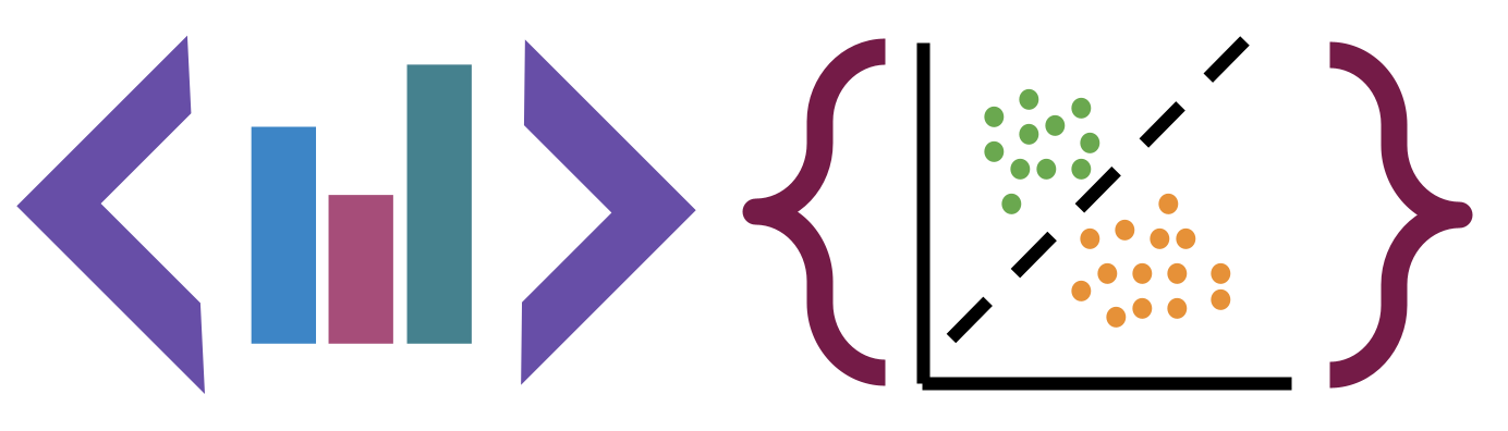
5. Visualization#
Data Visualization is about using plots, to convey informaiton and get a better understanding of the data.
5.1. Plotting in Python#
There are several popular plotting libaries:
matplotlib: low level plotting tools
seaborn: high level plotting with opinionated defaults
ggplot: plotting based on the ggplot library in R.
Plus pandas has a plot method
Pandas and seaborn use matplotlib under the hood.
Seaborn and ggplot both assume the data is set up as a DataFrame. Getting started with seaborn is the simplest, so we’ll use that.
5.2. Figure and axis level plots#
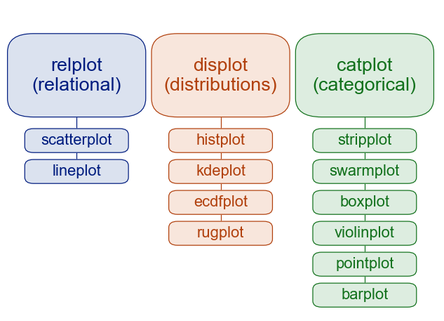
add the image to your notebook with the following:

5.3. Anatomy of a figure#
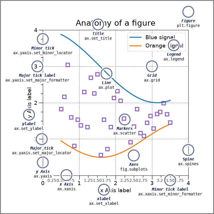
*this was drawn with code
add the image to your notebook with the following:

we will load pandas and seaborn
import pandas as pd
import seaborn as sns
and continue with the same data
carbon_data_url = 'https://github.com/rfordatascience/tidytuesday/raw/master/data/2024/2024-05-21/emissions.csv'
and the added column we made last class
carbon_df = pd.read_csv(carbon_data_url)
carbon_df['commodity_simple'] = carbon_df['commodity'].apply(lambda s: s if not('Coal' in s) else 'Coal')
---------------------------------------------------------------------------
HTTPError                                 Traceback (most recent call last)
Cell In[3], line 1
----> 1 carbon_df = pd.read_csv(carbon_data_url)
      2 carbon_df['commodity_simple'] = carbon_df['commodity'].apply(lambda s: s if not('Coal' in s) else 'Coal')

File /opt/hostedtoolcache/Python/3.8.18/x64/lib/python3.8/site-packages/pandas/io/parsers/readers.py:912, in read_csv(filepath_or_buffer, sep, delimiter, header, names, index_col, usecols, dtype, engine, converters, true_values, false_values, skipinitialspace, skiprows, skipfooter, nrows, na_values, keep_default_na, na_filter, verbose, skip_blank_lines, parse_dates, infer_datetime_format, keep_date_col, date_parser, date_format, dayfirst, cache_dates, iterator, chunksize, compression, thousands, decimal, lineterminator, quotechar, quoting, doublequote, escapechar, comment, encoding, encoding_errors, dialect, on_bad_lines, delim_whitespace, low_memory, memory_map, float_precision, storage_options, dtype_backend)
    899 kwds_defaults = _refine_defaults_read(
    900     dialect,
    901     delimiter,
   (...)
    908     dtype_backend=dtype_backend,
    909 )
    910 kwds.update(kwds_defaults)
--> 912 return _read(filepath_or_buffer, kwds)

File /opt/hostedtoolcache/Python/3.8.18/x64/lib/python3.8/site-packages/pandas/io/parsers/readers.py:577, in _read(filepath_or_buffer, kwds)
    574 _validate_names(kwds.get("names", None))
    576 # Create the parser.
--> 577 parser = TextFileReader(filepath_or_buffer, **kwds)
    579 if chunksize or iterator:
    580     return parser

File /opt/hostedtoolcache/Python/3.8.18/x64/lib/python3.8/site-packages/pandas/io/parsers/readers.py:1407, in TextFileReader.__init__(self, f, engine, **kwds)
   1404     self.options["has_index_names"] = kwds["has_index_names"]
   1406 self.handles: IOHandles | None = None
-> 1407 self._engine = self._make_engine(f, self.engine)

File /opt/hostedtoolcache/Python/3.8.18/x64/lib/python3.8/site-packages/pandas/io/parsers/readers.py:1661, in TextFileReader._make_engine(self, f, engine)
   1659     if "b" not in mode:
   1660         mode += "b"
-> 1661 self.handles = get_handle(
   1662     f,
   1663     mode,
   1664     encoding=self.options.get("encoding", None),
   1665     compression=self.options.get("compression", None),
   1666     memory_map=self.options.get("memory_map", False),
   1667     is_text=is_text,
   1668     errors=self.options.get("encoding_errors", "strict"),
   1669     storage_options=self.options.get("storage_options", None),
   1670 )
   1671 assert self.handles is not None
   1672 f = self.handles.handle

File /opt/hostedtoolcache/Python/3.8.18/x64/lib/python3.8/site-packages/pandas/io/common.py:716, in get_handle(path_or_buf, mode, encoding, compression, memory_map, is_text, errors, storage_options)
    713     codecs.lookup_error(errors)
    715 # open URLs
--> 716 ioargs = _get_filepath_or_buffer(
    717     path_or_buf,
    718     encoding=encoding,
    719     compression=compression,
    720     mode=mode,
    721     storage_options=storage_options,
    722 )
    724 handle = ioargs.filepath_or_buffer
    725 handles: list[BaseBuffer]

File /opt/hostedtoolcache/Python/3.8.18/x64/lib/python3.8/site-packages/pandas/io/common.py:368, in _get_filepath_or_buffer(filepath_or_buffer, encoding, compression, mode, storage_options)
    366 # assuming storage_options is to be interpreted as headers
    367 req_info = urllib.request.Request(filepath_or_buffer, headers=storage_options)
--> 368 with urlopen(req_info) as req:
    369     content_encoding = req.headers.get("Content-Encoding", None)
    370     if content_encoding == "gzip":
    371         # Override compression based on Content-Encoding header

File /opt/hostedtoolcache/Python/3.8.18/x64/lib/python3.8/site-packages/pandas/io/common.py:270, in urlopen(*args, **kwargs)
    264 """
    265 Lazy-import wrapper for stdlib urlopen, as that imports a big chunk of
    266 the stdlib.
    267 """
    268 import urllib.request
--> 270 return urllib.request.urlopen(*args, **kwargs)

File /opt/hostedtoolcache/Python/3.8.18/x64/lib/python3.8/urllib/request.py:222, in urlopen(url, data, timeout, cafile, capath, cadefault, context)
    220 else:
    221     opener = _opener
--> 222 return opener.open(url, data, timeout)

File /opt/hostedtoolcache/Python/3.8.18/x64/lib/python3.8/urllib/request.py:531, in OpenerDirector.open(self, fullurl, data, timeout)
    529 for processor in self.process_response.get(protocol, []):
    530     meth = getattr(processor, meth_name)
--> 531     response = meth(req, response)
    533 return response

File /opt/hostedtoolcache/Python/3.8.18/x64/lib/python3.8/urllib/request.py:640, in HTTPErrorProcessor.http_response(self, request, response)
    637 # According to RFC 2616, "2xx" code indicates that the client's
    638 # request was successfully received, understood, and accepted.
    639 if not (200 <= code < 300):
--> 640     response = self.parent.error(
    641         'http', request, response, code, msg, hdrs)
    643 return response

File /opt/hostedtoolcache/Python/3.8.18/x64/lib/python3.8/urllib/request.py:569, in OpenerDirector.error(self, proto, *args)
    567 if http_err:
    568     args = (dict, 'default', 'http_error_default') + orig_args
--> 569     return self._call_chain(*args)

File /opt/hostedtoolcache/Python/3.8.18/x64/lib/python3.8/urllib/request.py:502, in OpenerDirector._call_chain(self, chain, kind, meth_name, *args)
    500 for handler in handlers:
    501     func = getattr(handler, meth_name)
--> 502     result = func(*args)
    503     if result is not None:
    504         return result

File /opt/hostedtoolcache/Python/3.8.18/x64/lib/python3.8/urllib/request.py:649, in HTTPDefaultErrorHandler.http_error_default(self, req, fp, code, msg, hdrs)
    648 def http_error_default(self, req, fp, code, msg, hdrs):
--> 649     raise HTTPError(req.full_url, code, msg, hdrs, fp)

HTTPError: HTTP Error 404: Not Found
carbon_df.head()
---------------------------------------------------------------------------
NameError                                 Traceback (most recent call last)
Cell In[4], line 1
----> 1 carbon_df.head()

NameError: name 'carbon_df' is not defined
5.4. How are the samples distributed in time?#
We have not yet worked with th year column. An important first step we might want to know
is how the measurements are distributed in time.
From last class, wemight try value_counts
carbon_df['year'].value_counts()
---------------------------------------------------------------------------
NameError                                 Traceback (most recent call last)
Cell In[5], line 1
----> 1 carbon_df['year'].value_counts()

NameError: name 'carbon_df' is not defined
but it’s a little hard to read. A histogram might better
carbon_df['year'].plot(kind='hist')
---------------------------------------------------------------------------
NameError                                 Traceback (most recent call last)
Cell In[6], line 1
----> 1 carbon_df['year'].plot(kind='hist')

NameError: name 'carbon_df' is not defined
Here we see that thare are a lot more samples in more recent years.
5.5. Anatomy of a plot#
the above figure come from matplotlib’s Anatomy of a Figure page which includes the code to generate that figure
5.6. Figure and axis level plots#
5.7. Changing colors#
sns.set_palette('colorblind')
5.8. Emissions by type#
sns.catplot(data=carbon_df,x='commodity_simple', y='total_emissions_MtCO2e')
---------------------------------------------------------------------------
NameError                                 Traceback (most recent call last)
Cell In[8], line 1
----> 1 sns.catplot(data=carbon_df,x='commodity_simple', y='total_emissions_MtCO2e')

NameError: name 'carbon_df' is not defined
sns.catplot(data=carbon_df,x='commodity_simple', y='total_emissions_MtCO2e',kind='bar')
---------------------------------------------------------------------------
NameError                                 Traceback (most recent call last)
Cell In[9], line 1
----> 1 sns.catplot(data=carbon_df,x='commodity_simple', y='total_emissions_MtCO2e',kind='bar')

NameError: name 'carbon_df' is not defined
sns.catplot(data=carbon_df,x='commodity_simple', y='total_emissions_MtCO2e',kind='bar',
           col = 'parent_type')
---------------------------------------------------------------------------
NameError                                 Traceback (most recent call last)
Cell In[10], line 1
----> 1 sns.catplot(data=carbon_df,x='commodity_simple', y='total_emissions_MtCO2e',kind='bar',
      2            col = 'parent_type')

NameError: name 'carbon_df' is not defined
sns.catplot(data=carbon_df,x='commodity_simple', y='total_emissions_MtCO2e',kind='bar',
           col = 'parent_type',hue='commodity_simple')
---------------------------------------------------------------------------
NameError                                 Traceback (most recent call last)
Cell In[11], line 1
----> 1 sns.catplot(data=carbon_df,x='commodity_simple', y='total_emissions_MtCO2e',kind='bar',
      2            col = 'parent_type',hue='commodity_simple')

NameError: name 'carbon_df' is not defined
Example okay questions:
which parent type has the most constent emissions across commodity type?
which parent type has highest emission?
Example good questions
which type of emissions should be targeted for interventions (the highest)?
5.9. Emissions over time?#
sns.relplot(data=carbon_df, x='year', y='total_emissions_MtCO2e',
           hue ='parent_entity',row ='parent_type')
---------------------------------------------------------------------------
NameError                                 Traceback (most recent call last)
Cell In[12], line 1
----> 1 sns.relplot(data=carbon_df, x='year', y='total_emissions_MtCO2e',
      2            hue ='parent_entity',row ='parent_type')

NameError: name 'carbon_df' is not defined
5.10. Variable types and data types#
Related but not the same.
Data types are literal, related to the representation in the computer.
ther can be int16, int32, int64
We can also have mathematical types of numbers
Integers can be positive, 0, or negative.
Reals are continuous, infinite possibilities.
Variable types are about the meaning in a conceptual sense.
categorical (can take a discrete number of values, could be used to group data, could be a string or integer; unordered)
continuous (can take on any possible value, always a number)
binary (like data type boolean, but could be represented as yes/no, true/false, or 1/0, could be categorical also, but often makes sense to calculate rates)
ordinal (ordered, but appropriately categorical)
we’ll focus on the first two most of the time. Some values that are technically only integers range high enough that we treat them more like continuous most of the time.
carbon_df.columns
---------------------------------------------------------------------------
NameError                                 Traceback (most recent call last)
Cell In[13], line 1
----> 1 carbon_df.columns

NameError: name 'carbon_df' is not defined
5.11. Questions After Class#
Class Response Summary:
5.11.1. To what degree should we be familiarizing ourselves with these different kinds of graphs?#
There is also a full semester data visualization class, so we will not cover everything it is useful to know a few basic ones and we will look to see that you can create and correctly interpret at least 3 different kinds.
5.11.2. Should I upload all parts of A2 today if I plan to go to office hours tomorrow? Or just the finished parts?#
All of it with your questions written in the file(s).
5.11.3. is there ways to overlap the different parent types into the same graph?#
This is called a stacked bar graph, there are examples in the seaborn tutorials for displot but with an important caveat that that can make some things hard to see and you can also stack with the low level features
5.11.4. is the ggplot option just the same method names as the version in R? or is the syntax updated to be similar also?#
I think its mostly matching method names, attribute names, and conceptual ideas. Python libraries all have to use Python syntax.
5.11.5. Is the peer review just for assignment 3 or will we have the option to do it for future assignments?#
Probably only 3, but possibly a couple more.
5.11.6. What is the typical range of sizes for a good dataset for this assignment#
hundred to maybe 2000, you do not need more than that and too many can make it slow
5.11.7. if we don’t get any achievements on an assignment are we able to revise them to get an achievement?#
If you are very close, yes, if you are not very close, you will get advice that we recommend you apply on future assignments.
5.11.8. What is a numpy array?#
A DataType that one of the attributes of a DataFrame takes. See the glossary entry for numpy array and the intro to DataFrames