
15. Regression#
15.1. Feedback#
See prismia notes for feedback qualitative comments
15.2. Setting up for regression#
We’re going to predict tip from total bill. This is a regression problem because the target, tip is:
available in the data (makes it supervised) and
a continuous value. The problems we’ve seen so far were all classification, species of iris and the character in that corners data were both categorical.
Using linear regression is also a good choice because it makes sense that the tip would be approximately linearly related to the total bill, most people pick some percentage of the total bill. If we our prior knowledge was that people typically tipped with some more complicated function, this would not be a good model.
import numpy as np
import seaborn as sns
import matplotlib.pyplot as plt
from sklearn import datasets, linear_model
from sklearn.metrics import mean_squared_error, r2_score
from sklearn.model_selection import train_test_split
import pandas as pd
sns.set_theme(font_scale=2,palette='colorblind')
We wil load this data from seaborn
tips_df = sns.load_dataset('tips')
tips_df.head()
| total_bill | tip | sex | smoker | day | time | size | |
|---|---|---|---|---|---|---|---|
| 0 | 16.99 | 1.01 | Female | No | Sun | Dinner | 2 |
| 1 | 10.34 | 1.66 | Male | No | Sun | Dinner | 3 |
| 2 | 21.01 | 3.50 | Male | No | Sun | Dinner | 3 |
| 3 | 23.68 | 3.31 | Male | No | Sun | Dinner | 2 |
| 4 | 24.59 | 3.61 | Female | No | Sun | Dinner | 4 |
Since we will use only one variable, we have to do some extra work. When we use sklearn with a DataFrame, it picks out the values, like this:
tips_df['total_bill'].values
array([16.99, 10.34, 21.01, 23.68, 24.59, 25.29,  8.77, 26.88, 15.04,
       14.78, 10.27, 35.26, 15.42, 18.43, 14.83, 21.58, 10.33, 16.29,
       16.97, 20.65, 17.92, 20.29, 15.77, 39.42, 19.82, 17.81, 13.37,
       12.69, 21.7 , 19.65,  9.55, 18.35, 15.06, 20.69, 17.78, 24.06,
       16.31, 16.93, 18.69, 31.27, 16.04, 17.46, 13.94,  9.68, 30.4 ,
       18.29, 22.23, 32.4 , 28.55, 18.04, 12.54, 10.29, 34.81,  9.94,
       25.56, 19.49, 38.01, 26.41, 11.24, 48.27, 20.29, 13.81, 11.02,
       18.29, 17.59, 20.08, 16.45,  3.07, 20.23, 15.01, 12.02, 17.07,
       26.86, 25.28, 14.73, 10.51, 17.92, 27.2 , 22.76, 17.29, 19.44,
       16.66, 10.07, 32.68, 15.98, 34.83, 13.03, 18.28, 24.71, 21.16,
       28.97, 22.49,  5.75, 16.32, 22.75, 40.17, 27.28, 12.03, 21.01,
       12.46, 11.35, 15.38, 44.3 , 22.42, 20.92, 15.36, 20.49, 25.21,
       18.24, 14.31, 14.  ,  7.25, 38.07, 23.95, 25.71, 17.31, 29.93,
       10.65, 12.43, 24.08, 11.69, 13.42, 14.26, 15.95, 12.48, 29.8 ,
        8.52, 14.52, 11.38, 22.82, 19.08, 20.27, 11.17, 12.26, 18.26,
        8.51, 10.33, 14.15, 16.  , 13.16, 17.47, 34.3 , 41.19, 27.05,
       16.43,  8.35, 18.64, 11.87,  9.78,  7.51, 14.07, 13.13, 17.26,
       24.55, 19.77, 29.85, 48.17, 25.  , 13.39, 16.49, 21.5 , 12.66,
       16.21, 13.81, 17.51, 24.52, 20.76, 31.71, 10.59, 10.63, 50.81,
       15.81,  7.25, 31.85, 16.82, 32.9 , 17.89, 14.48,  9.6 , 34.63,
       34.65, 23.33, 45.35, 23.17, 40.55, 20.69, 20.9 , 30.46, 18.15,
       23.1 , 15.69, 19.81, 28.44, 15.48, 16.58,  7.56, 10.34, 43.11,
       13.  , 13.51, 18.71, 12.74, 13.  , 16.4 , 20.53, 16.47, 26.59,
       38.73, 24.27, 12.76, 30.06, 25.89, 48.33, 13.27, 28.17, 12.9 ,
       28.15, 11.59,  7.74, 30.14, 12.16, 13.42,  8.58, 15.98, 13.42,
       16.27, 10.09, 20.45, 13.28, 22.12, 24.01, 15.69, 11.61, 10.77,
       15.53, 10.07, 12.6 , 32.83, 35.83, 29.03, 27.18, 22.67, 17.82,
       18.78])
This is because originally sklearn actualy only worked on numpy arrays and sot what they do now is pull it out of the DataFrame, it gives us a numpy array:
type(tips_df['total_bill'].values)
numpy.ndarray
All sklearn estimator objects are designed to work on multiple features, which mean they expect that the features have a 2D shape, but when we pick out a single column’s (pandas Series) values, we get a 1D shape:
tips_df['total_bill'].values.shape
(244,)
We can change this by adding an axis. It doesn’t change values, but changes the way it is represented enough that it has the properties we need.
tips_X = tips_df['total_bill'].values[:,np.newaxis]
This has the shape we want:
tips_X.shape
(244, 1)
and is still the same type
type(tips_X)
numpy.ndarray
The target is expected to be a single feature, so we do not need to do anythign special.
tips_y = tips_df['tip']
Next, we split the data
tips_X_train, tips_X_test, tips_y_train, tips_y_test = train_test_split(tips_X,tips_y)
15.3. Fitting a regression model#
We instantiate the object as we do with all other sklearn estimator objects.
regr = linear_model.LinearRegression()
and fit liek the others too.
regr.fit(tips_X_train, tips_y_train)
LinearRegression()In a Jupyter environment, please rerun this cell to show the HTML representation or trust the notebook.
On GitHub, the HTML representation is unable to render, please try loading this page with nbviewer.org.
LinearRegression()
we also can predict as before
tips_y_pred = regr.predict(tips_X_test)
15.4. Regression Predictions#
Linear regression is making the assumption that the target is a linear function of the features so that we can use the equation for a line(for scalar variables):
becomes equivalent to the following code assuming they were all vectors/matrices
i = 1 # could be any number from 0 ... len(target)
target[i] = regr.coef_*features[i]+ regr.intercept_
You can match these up one for one.
targetis \(y\) (this is why we usually put the_y_in the varaible name)regr.coef_is the slope, \(m\)featuresare the \(x\) (like for y, we label that way)adn
regr.intercept_is the \(b\) or the y intercept.
Important
I have tried to expand the detail here substantively. Use the link at the top of the page to make an issue if you have specific questions
We will look at each of them and store them to variables here
slope = regr.coef_
slope
array([0.09739754])
intercept = regr.intercept_
intercept
1.0820985670501073
Show code cell content
# extra import so that I can use the values of variables from the code outside of the
# code cells on the website
from myst_nb import glue

# "gluing" these variables for use
glue('slope_pct',slope*100)
glue('intercept',intercept)
glue('slope_rnd',np.round(slope*100))
glue('intercept_rnd',np.round(intercept*100)/100)
array([9.7397543])
1.0820985670501073
array([10.])
1.08
Important
This is what our model predicts the tip will be based on the past data. It is important to note that this is not what the tip should be by any sort of virtues. For example, a typical normative rule for tipping is to tip 15% or 20%. the model we learned, from this data, however is array([9.7397543])% + $1.0820985670501073.
now we can pull out our first \(x\) and calculate a predicted value of \(y\) manually
slope*tips_X_test[0] + intercept
array([2.76318016])
and see that this matches exactly the prediction from the predict method.
tips_y_pred[0]
2.763180158384016
Important
Note that my random seed is not fixed, so the values there are going to change each time the website is updated, but that these values will always be true
15.5. Visualizing Regression#
Since we only have one feature, we can visualize what was learned here. We will use plain
matplotlib plots because we are plotting from numpy arrays not data frames.
plt.scatter(tips_X_test,tips_y_test, color='black')
plt.scatter(tips_X_test,tips_y_pred, color='blue')
<matplotlib.collections.PathCollection at 0x7f60141dc1f0>
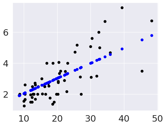
This plots the predictions in blue vs the real data in black. The above uses them both as scatter plots to make it more clear, below, like in class, I’ll use a normally inconvenient aspect of a line plot to show all the predictions the model could make in this range.
plt.scatter(tips_X_test,tips_y_test, color='black')
plt.plot(tips_X_test,tips_y_pred, color='blue')
[<matplotlib.lines.Line2D at 0x7f6012113f40>]
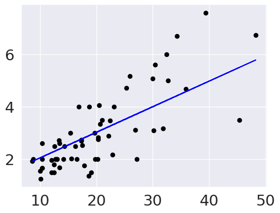
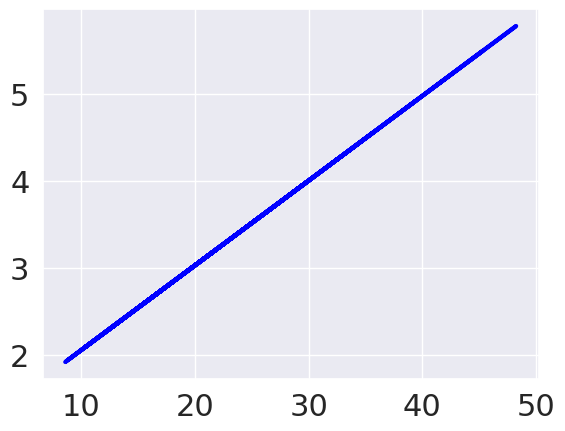
Since the predictions are prefectly in a line, if I use a line plot instead of scatter to connect them all, it makes a line.
15.6. Evaluating Regression - Mean Squared Error#
From the plot, we can see that there is some error for each point, so accuracy that we’ve been using, won’t work. One idea is to look at how much error there is in each prediction, we can look at that visually first.
These red lines are the residuals, or errors in each prediction.
In this code block, I use zip a
builtin function in Python
to iterate over all of the test samples and predictions (they’re all the same length)
and plot each red line in a list comprehension. This could have been a for loop, but
the comprehension is slighly more compact visually. The zip allows us to have a Pythonic,
easy to read loop that iterates over multiple variables.
To mape a vertical line, I make a line plot with just two values. My plotted data is:
[x,x],[yp,yt] so the first point is (x,yp) and the second is x,yt.
The ; at the end of each line suppressed the text output.
# plot line prediction
plt.plot(tips_X_test, tips_y_pred, color='blue', linewidth=3);

# draw vertical lines from each data point to its predict value
[plt.plot([x,x],[yp,yt], color='red', linewidth=3, markevery=[0], marker ='^')
                 for x, yp, yt in zip(tips_X_test, tips_y_pred,tips_y_test)];

# plot these last so they are visually on top
plt.scatter(tips_X_test, tips_y_test,  color='black');
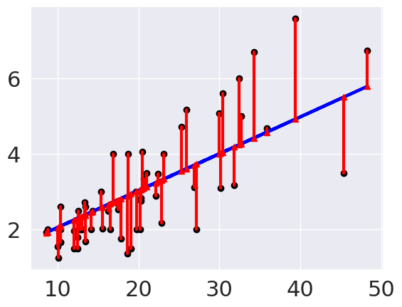
From this we can see that the errors are relatively small, which matches what we saw with the mean squared error.
To see mroe about how the code above works:
Show code cell content
plt.plot(tips_X_test, tips_y_pred, color='blue', linewidth=3);

# draw vertical lines from each data point to its predict value
for i in range(len(tips_X_test)):
    x = tips_X_test[i]
    yp = y_pred[i]
    yt = tips_y_test[i]
    plt.plot([x,x],[yp,yt], color='red', linewidth=3, markevery=[0], marker ='^')

plt.scatter(tips_X_test, tips_y_test,  color='black');
---------------------------------------------------------------------------
NameError                                 Traceback (most recent call last)
Cell In[22], line 6
      4 for i in range(len(tips_X_test)):
      5     x = tips_X_test[i]
----> 6     yp = y_pred[i]
      7     yt = tips_y_test[i]
      8     plt.plot([x,x],[yp,yt], color='red', linewidth=3, markevery=[0], marker ='^')

NameError: name 'y_pred' is not defined
We can use the average length of these red lines to capture the error. To get the length, we can take the difference between the prediction and the data for each point. Some would be positive and others negative, so we will square each one then take the average.
mean_squared_error(tips_y_test,tips_y_pred)
0.8616503313022786
Which is equivalent to:
np.mean((tips_y_test-tips_y_pred)**2)
0.8616503313022786
To interpret this, we can take the square root to get it back into dollars. This becomes equivalent to taking the mean absolute value of the error.
mean_abs_error = np.sqrt(mean_squared_error(tips_y_test,tips_y_pred))
mean_abs_error
0.9282512220849907
np.mean(np.abs(tips_y_test-tips_y_pred))
0.7156766975702178
Still, to know if this is a big or small error, we have to compare it to the values we were predicting
tips_y_test.describe()
count    61.000000
mean      2.979016
std       1.456722
min       1.250000
25%       2.000000
50%       2.600000
75%       3.500000
max       7.580000
Name: tip, dtype: float64
avg_tip = tips_y_test.mean()
tip_var = tips_y_test.var()
avg_tip, tip_var
(2.9790163934426235, 2.1220390163934426)
Show code cell content
glue('mae',mean_abs_error)
glue('avtip',avg_tip)
0.9282512220849907
2.9790163934426235
We can see that the error is smaller than most of the tips.
15.7. Evaluating Regression - R2#
We can also use the \(R^2\) score, the coefficient of determination.
If we have the following:
\(n\) `=len(y_test)``
\(y\)
=y_test\(y_i\)
=y_test[i]\(\hat{y}\) =
y_pred\(\bar{y} = \frac{1}{n}\sum_{i=0}^n y_i\) =
sum(y_test)/len(y_test)
r2_score(tips_y_test, tips_y_pred)
0.5871842301720915
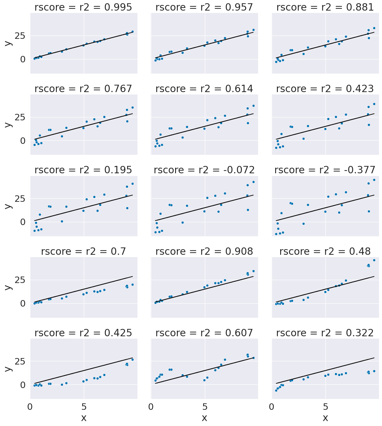
This is a bit harder to interpret, but we can use some additional plots to visualize. This code simulates data by randomly picking 20 points, spreading them out and makes the “predicted” y values by picking a slope of 3. Then I simulated various levels of noise, by sampling noise and multiplying the same noise vector by different scales and adding all of those to a data frame with the column name the r score for if that column of target values was the truth.
Then I added some columns of y values that were with different slopes and different functions of x. These all have the small amount of noise.
# pick some random points
x = 10*np.random.random(20)
# make a line with a fixed slope
y_pred = 3*x
# put it in a data frame
ex_df = pd.DataFrame(data = x,columns = ['x'])
ex_df['y_pred'] = y_pred
# set some amounts of noise
n_levels = range(1,18,2)
# sample random noies
noise = (np.random.random(20)-.5)*2
# add the noise and put it in the data frame with col title the r2
for n in n_levels:
    y_true = y_pred + n* noise
    ex_df['r2 = '+ str(np.round(r2_score(y_pred,y_true),3))] = y_true

# set some other functions
f_x_list = [2*x,3.5*x,.5*x**2, .03*x**3, 10*np.sin(x)+x*3,3*np.log(x**2)]
# add them to the noise and store with r2 col title
for fx in f_x_list:
    y_true = fx + noise
    ex_df['r2 = '+ str(np.round(r2_score(y_pred,y_true),3))] = y_true

# make the data tidy for plotting
xy_df = ex_df.melt(id_vars=['x','y_pred'],var_name='rscore',value_name='y')
# make a custom grid by using facet grid directly
g = sns.FacetGrid(data = xy_df,col='rscore',col_wrap=3,aspect=1.5,height=3)
# plot the lin
g.map(plt.plot, 'x','y_pred',color='k')
# plot the dta
g.map(sns.scatterplot, "x", "y",)
<seaborn.axisgrid.FacetGrid at 0x7f6011bb0fa0>
r2_score(tips_y_test,tips_y_pred)
0.5871842301720915
This can help us interpret the score on our own too.
mean_squared_error(tips_y_test,tips_y_pred)
0.8616503313022786
regr.score(tips_X_test,tips_y_test)
0.5871842301720915
15.8. Questions after class#
15.8.1. How do you know if a regression model is good or works for a dataset?#
Let’s break this down. Regression is supervised learning, so there needs to be variables that you can use as features and one to use as the target. To test if supervised learning makes sense, try filling column names in place of features and target in the following sentence, that describes a prediction task: we want to predict target from features.
Regression, specifically means that the target variable needs to be continuous, not discrete. For example, in today’s class, we predicted the tip in dollars, which is continous in this sense. This is not stictly continuous in the mathematical sense, but anything that is most useful to consider as continuous.
logisitic regression is actually a classification model despite the name
15.8.2. So is regression is just used with numeric values in terms of predicting?#
Yes linear regression requires numeric values for the features as well as the target.
Other types of regression can use other types of features.
All regression is for a continusous target.
15.8.3. What are the strengths of a regression model as opposed to the previous models we’ve seen?#
Using regression, classification, or clustering is based on what type of problem you are solving.
Our simple flowchart for what task you are doing is:
15.8.4. Are linear models exclusively used for regression problems?#
No, there are also linear classification models.
15.8.5. What does a negative R2 score mean?#
It’s a bad fit.
15.8.6. What is the difference between a good and bad rscore?#
1 is perfect, low is bad. What is “good enough” is context dependent.
15.8.7. why were your values coming out negative?#
Mine was not a very good fit. We’ll see why on Thursday. Yours may have been better
15.8.8. What would be a common example of a real-world linear regression?#
Lots of real models are linear regression, but with many inputs. It is often not a perfect fit, but good enough.
15.8.9. what are the coefficient and intercept ?#
The coefficient is the slope of the line and the intercept is the value of the label the model predicts for features =0.
15.8.10. how do you add string data thats not binary e.g ‘True’ ‘False’ to make it fit in data?#
You have to transform it to be numerical. If it is True and False, you can cast it to integers.
I recommend for A9 filtering on the UCI website to pick out data with numerical features.
In general, and you can for A9 if you want, use the sklearn LabelEncodeer to transform the data.