Class 7: Visualization for EDA
Announcements
Syllabus updated
rubric for summarize and visualize are slightly changed
Please accept assignments if you plan to not complete for any reason
Assignment updated to clarify continuous and categorical variables
Loading Data
Importing the libraries for today. We’ll continue plotting with pandas and we’ll use seaborn as well. Seaborn provides higher level plotting functions and better formatting.
import pandas as pd
import seaborn as sns
Loading the data as usual.
data_url = 'https://raw.githubusercontent.com/brownsarahm/python-socialsci-files/master/data/SAFI_full_shortname.csv'
We know that the key_id column should be used as an index, not as data, so we’ll use the index_col parameter t do that from the beginning.
safi_df = pd.read_csv(data_url,index_col='key_id')
safi_df.head()
| interview_date | quest_no | start | end | province | district | ward | village | years_farm | agr_assoc | ... | items_owned | items_owned_other | no_meals | months_lack_food | no_food_mitigation | gps_Latitude | gps_Longitude | gps_Altitude | gps_Accuracy | instanceID | |
|---|---|---|---|---|---|---|---|---|---|---|---|---|---|---|---|---|---|---|---|---|---|
| key_id | |||||||||||||||||||||
| 1 | 17 November 2016 | 1 | 2017-03-23T09:49:57.000Z | 2017-04-02T17:29:08.000Z | Manica | Manica | Bandula | God | 11 | no | ... | ['bicycle' ; 'television' ; 'solar_panel' ; ... | NaN | 2 | ['Jan'] | ['na' ; 'rely_less_food' ; 'reduce_meals' ; ... | -19.112259 | 33.483456 | 698 | 14.0 | uuid:ec241f2c-0609-46ed-b5e8-fe575f6cefef |
| 2 | 17 November 2016 | 1 | 2017-04-02T09:48:16.000Z | 2017-04-02T17:26:19.000Z | Manica | Manica | Bandula | God | 2 | yes | ... | ['cow_cart' ; 'bicycle' ; 'radio' ; 'cow_pl... | NaN | 2 | ['Jan' ; 'Sept' ; 'Oct' ; 'Nov' ; 'Dec'] | ['na' ; 'reduce_meals' ; 'restrict_adults' ;... | -19.112477 | 33.483416 | 690 | 19.0 | uuid:099de9c9-3e5e-427b-8452-26250e840d6e |
| 3 | 17 November 2016 | 3 | 2017-04-02T14:35:26.000Z | 2017-04-02T17:26:53.000Z | Manica | Manica | Bandula | God | 40 | no | ... | ['solar_torch'] | NaN | 2 | ['Jan' ; 'Feb' ; 'Mar' ; 'Oct' ; 'Nov' ; ... | ['na' ; 'restrict_adults' ; 'lab_ex_food'] | -19.112108 | 33.483450 | 674 | 13.0 | uuid:193d7daf-9582-409b-bf09-027dd36f9007 |
| 4 | 17 November 2016 | 4 | 2017-04-02T14:55:18.000Z | 2017-04-02T17:27:16.000Z | Manica | Manica | Bandula | God | 6 | no | ... | ['bicycle' ; 'radio' ; 'cow_plough' ; 'sola... | NaN | 2 | ['Sept' ; 'Oct' ; 'Nov' ; 'Dec'] | ['na' ; 'reduce_meals' ; 'restrict_adults' ;... | -19.112229 | 33.483424 | 679 | 5.0 | uuid:148d1105-778a-4755-aa71-281eadd4a973 |
| 5 | 17 November 2016 | 5 | 2017-04-02T15:10:35.000Z | 2017-04-02T17:27:35.000Z | Manica | Manica | Bandula | God | 18 | no | ... | ['motorcyle' ; 'radio' ; 'cow_plough' ; 'mo... | NaN | 2 | ['Aug' ; 'Sept' ; 'Oct' ; 'Nov'] | ['na' ; 'go_forest' ; 'migrate'] | -19.112217 | 33.483425 | 689 | 10.0 | uuid:2c867811-9696-4966-9866-f35c3e97d02d |
5 rows × 64 columns
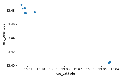
We can make scatter plots as we saw Friday.
safi_df.plot.scatter('gps_Latitude','gps_Longitude')
<AxesSubplot:xlabel='gps_Latitude', ylabel='gps_Longitude'>
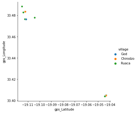
With seaborn, however, we can control it more, changing the color of the points based on a column of the data.
sns.relplot(x= 'gps_Latitude',y='gps_Longitude',
           data=safi_df, hue='village')
<seaborn.axisgrid.FacetGrid at 0x7f05c06aea50>
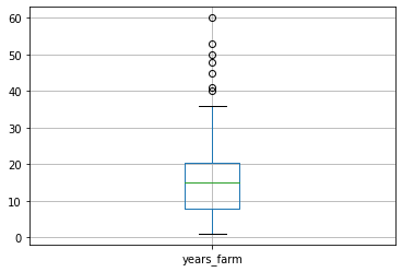
We can also plot a single variable to see the quantiles (the box is 25%-50%) and see if there are outliers (the points outside the box).
safi_df.boxplot('years_farm')
<AxesSubplot:>
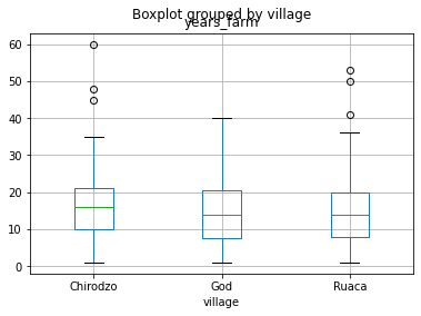
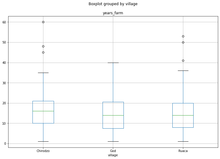
We can do some more conditiioning, even with only pandas. Using the by parameter will do a groupby operation first and then make the plot.
safi_df.boxplot('years_farm', by='village')
<AxesSubplot:title={'center':'years_farm'}, xlabel='village'>
We can also make the figure larger
safi_df.boxplot('years_farm', by='village',figsize=(12,8))
<AxesSubplot:title={'center':'years_farm'}, xlabel='village'>
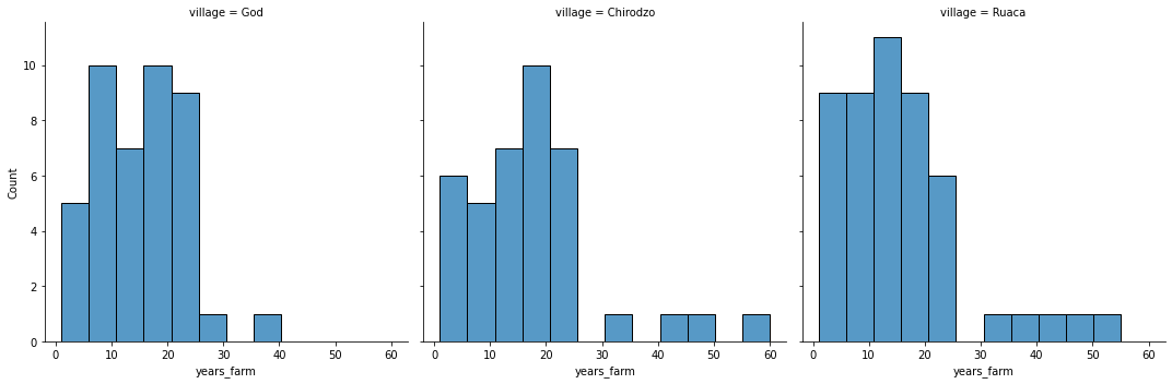
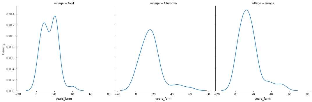
We can see how a single variable is distributed in more detail with the seaborn displot.
sns.displot(data=safi_df, x='years_farm',col='village')
<seaborn.axisgrid.FacetGrid at 0x7f05c0326c50>
sns.displot(data=safi_df, x='years_farm',col='village',kind='kde')
<seaborn.axisgrid.FacetGrid at 0x7f05c032d150>
Updating Seaborn
the displot is new in seaborn 0.11, on your terminal (mac, linux) or anaconda prompt(Windows):
pip install update seaborn
Then restart your notebook’s kernel and re-run all cells
or, in a notebook, you can update with
!pip install seaborn==0.11.0
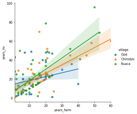
Regression plots
We can also plot with some calculations done for us already.
sns.lmplot(x='years_farm',y='years_liv', data=safi_df,
           hue='village')
<seaborn.axisgrid.FacetGrid at 0x7f05bde67e50>
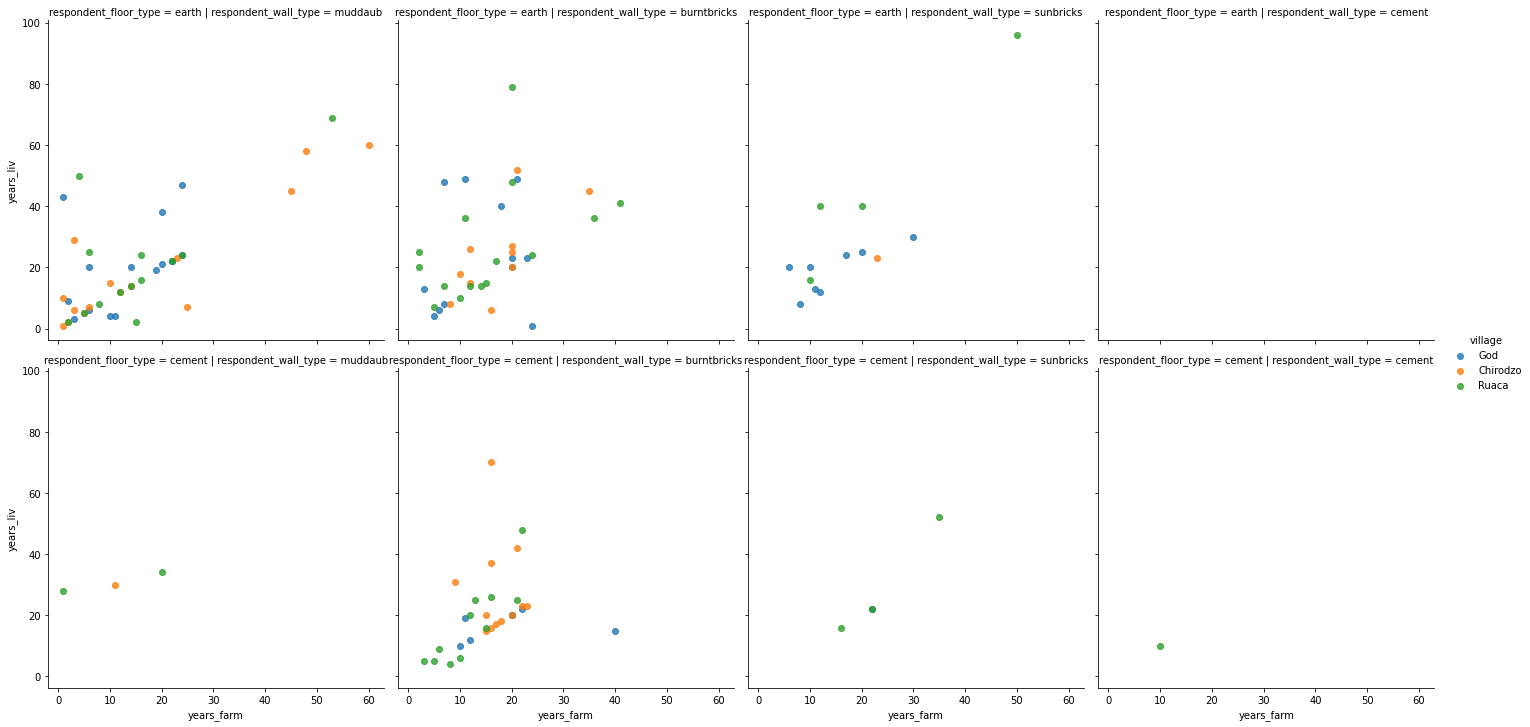
And we can make grids of plots with the row and col parameters. We can turn off the regression lines with the fit_reg parameter.
sns.lmplot(x='years_farm',y='years_liv', data=safi_df,
           hue='village',  col='respondent_wall_type',row='respondent_floor_type',
           fit_reg=False)
<seaborn.axisgrid.FacetGrid at 0x7f05c017bfd0>
safi_df.groupby('poultry')['members_count'].mean()
poultry
no     5.894737
yes    7.720430
Name: members_count, dtype: float64
Questions after class
More practice
Test out the parameters of the plotting functions to see what they do.
Further Reading
If you’ve made it this far, let me know how you found these notes.