Clustering
Contents
22. Clustering#
import matplotlib.pyplot as plt
import numpy as np
import seaborn as sns
from sklearn import datasets
from sklearn.cluster import KMeans
import string
import pandas as pd
Clustering is unsupervised learning. That means we do not have the labels to learn from. We aim to learn both the labels for each point and some way of characterizing the classes at the same time.
Computationally, this is a harder problem. Mathematically, we can typically solve problems when we have a number of equations equal to or greater than the number of unknowns. For \(N\) data points ind \(d\) dimensions and \(K\) clusters, we have \(N\) equations and \(N + K*d\) unknowns. This means we have a harder problem to solve.
For today, we’ll see K-means clustering which is defined by \(K\) a number of clusters and a mean (center) for each one. There are other K-centers algorithms for other types of centers.
22.1. How does Kmeans work?#
We will start with some synthetics data and then see how the clustering works.
C = 4
N = 200
classes = list(string.ascii_uppercase[:C])
mu = {c: i for c, i in zip(classes,[[2,2], [6,6], [2,6],[6,2]])}
sigma = {c: i*.5 for c, i in zip(classes,np.random.random(4))}
sigma
target5 = np.random.choice(classes,N)
data5 = [np.random.multivariate_normal(mu[c],.25*np.eye(2)) for c in target5]
df5 = pd.DataFrame(data = data5,columns = ['x' + str(i) for i in range(2)]).round(2)
df5['char'] = target5
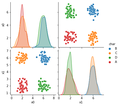
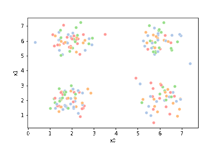
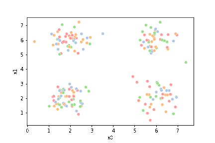
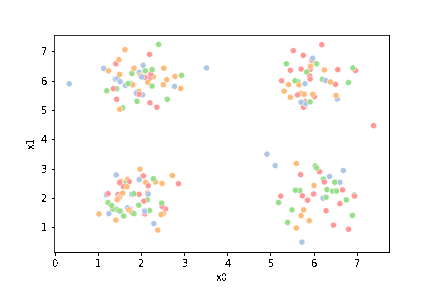
sns.pairplot(data =df5, hue='char')
<seaborn.axisgrid.PairGrid at 0x7f95d0782790>
First, we’ll pick just the data columns.
df = df5[['x0','x1']]
df.head()
| x0 | x1 | |
|---|---|---|
| 0 | 6.28 | 5.48 |
| 1 | 2.27 | 6.23 |
| 2 | 6.05 | 1.68 |
| 3 | 5.69 | 5.87 |
| 4 | 5.15 | 1.41 |
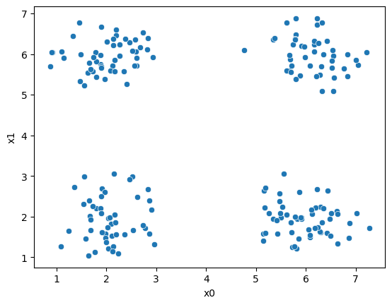
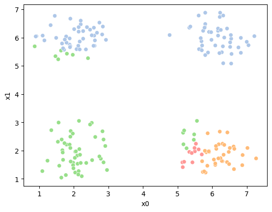
sns.scatterplot(data=df,x='x0',y='x1')
<AxesSubplot:xlabel='x0', ylabel='x1'>
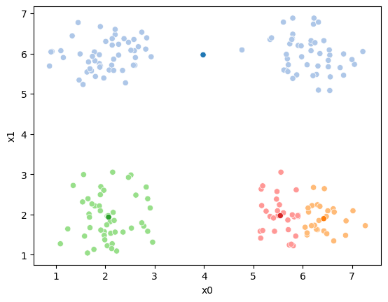
Next, we’ll pick 4 random points to be the starting points as the means.
K = 4
mu0 = df.sample(n=K).values
mu0
array([[6.52, 5.83],
       [5.91, 1.95],
       [5.17, 2.22],
       [5.5 , 1.97]])
Now, we will compute, fo each sample which of those four points it is closest to first by taking the difference, squaring it, then summing along each row.
[((df-mu_i)**2).sum(axis=1) for mu_i in mu0]
[0       0.1801
 1      18.2225
 2      17.4434
 3       0.6905
 4      21.4133
         ...
 195    18.5770
 196     8.6500
 197    15.2840
 198    34.6760
 199     0.2405
 Length: 200, dtype: float64,
 0      12.5978
 1      31.5680
 2       0.0925
 3      15.4148
 4       0.8692
         ...
 195     0.5213
 196     1.3325
 197     0.0005
 198    13.9229
 199    12.3400
 Length: 200, dtype: float64,
 0      11.8597
 1      24.4901
 2       1.0660
 3      13.5929
 4       0.6565
         ...
 195     2.2324
 196     0.8410
 197     0.5954
 198     9.0770
 199    11.5145
 Length: 200, dtype: float64,
 0      12.9285
 1      28.5805
 2       0.3866
 3      15.2461
 4       0.4361
         ...
 195     1.1826
 196     1.1700
 197     0.1600
 198    11.0368
 199    12.6145
 Length: 200, dtype: float64]
This gives us a list of 4 data DataFrames, one for each mean (mu), with one row for each point in the dataset with the distance from that point to the corresponding mean. We can stack these into one DataFrame.
pd.concat([((df-mu_i)**2).sum(axis=1) for mu_i in mu0],axis=1).head()
| 0 | 1 | 2 | 3 | |
|---|---|---|---|---|
| 0 | 0.1801 | 12.5978 | 11.8597 | 12.9285 |
| 1 | 18.2225 | 31.5680 | 24.4901 | 28.5805 |
| 2 | 17.4434 | 0.0925 | 1.0660 | 0.3866 |
| 3 | 0.6905 | 15.4148 | 13.5929 | 15.2461 |
| 4 | 21.4133 | 0.8692 | 0.6565 | 0.4361 |
Now we have one row per sample and one column per mean, with with the distance from that point to the mean. What we want is to calculate the assignment, which
mean is closest, for each point. Using idxmin with axis=1 we take the
minimum across each row and returns the index (location) of that minimum.
pd.concat([((df-mu_i)**2).sum(axis=1) for mu_i in mu0],axis=1).idxmin(axis=1).head()
0    0
1    0
2    1
3    0
4    3
dtype: int64
We’ll save all of this in a column named '0'. Since it is our 0th iteration.
df['0'] = pd.concat([((df-mu_i)**2).sum(axis=1) for mu_i in mu0],axis=1).idxmin(axis=1)

df.head()
| x0 | x1 | 0 | |
|---|---|---|---|
| 0 | 6.28 | 5.48 | 0 |
| 1 | 2.27 | 6.23 | 0 |
| 2 | 6.05 | 1.68 | 1 |
| 3 | 5.69 | 5.87 | 0 |
| 4 | 5.15 | 1.41 | 3 |
Here, we’ll set up some helper code.
data_cols = ['x0','x1']
def mu_to_df(mu,i):
    mu_df = pd.DataFrame(mu,columns=data_cols)
    mu_df['iteration'] = str(i)
    mu_df['class'] = ['M'+str(i) for i in range(K)]
    mu_df['type'] = 'mu'
    return mu_df

# color maps, we select every other value from this palette that has 8 values & is paird
cmap_pt = sns.color_palette('tab20',8)[1::2] # starting from 1
cmap_mu = sns.color_palette('tab20',8)[0::2] # starting form 0
Now we can plot the data, save the axis, and plot the means on top of that.
Seaborn plotting functions return an axis, by saving that to a variable, we
can pass it to the ax parameter of another plotting function so that both
plotting functions go on the same figure.
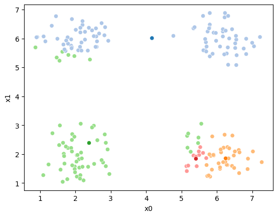
sfig = sns.scatterplot(data=df,x='x0',y='x1', hue='0',
                       palette =cmap_pt,legend=False)
mu_df = mu_to_df(mu0,0)
sns.scatterplot(data=mu_df, x='x0',y='x1',hue='class',
                palette=cmap_mu,legend=False, ax=sfig)
<AxesSubplot:xlabel='x0', ylabel='x1'>

We see that each point is assigned to the lighter shade of its matching mean. These points are the one that is closest to each point, but they’re not the centers of the point clouds. Now, we can compute new means of the points assigned to each cluster, using groupby.
mu1 = df.groupby('0')[data_cols].mean().values
mu1
array([[4.16483146, 6.01157303],
       [6.24918919, 1.85162162],
       [2.38571429, 2.3847619 ],
       [5.40818182, 1.83909091]])
We can plot these again, the same data, but with the new means.
sfig = sns.scatterplot(data=df,x='x0',y='x1', hue='0',
                       palette =cmap_pt,legend=False)
mu_df = mu_to_df(mu1,0)
sns.scatterplot(data=mu_df, x='x0',y='x1',hue='class',
                palette=cmap_mu,legend=False, ax=sfig)
<AxesSubplot:xlabel='x0', ylabel='x1'>
We see that now the means are in the center of each cluster, but that there are now points in one color that are assigned to other clusters.
So, again we can update the assignments.
df['1'] = pd.concat([((df[data_cols]-mu_i)**2).sum(axis=1) for mu_i in mu1],axis=1).idxmin(axis=1)
And plot again.
sfig = sns.scatterplot(data=df,x='x0',y='x1', hue='0',
                       palette =cmap_pt,legend=False)
mu_df = mu_to_df(mu,0)
sns.scatterplot(data=mu_df, x='x0',y='x1',hue='class',
                palette=cmap_mu,legend=False, ax=sfig)
<AxesSubplot:xlabel='x0', ylabel='x1'>
If we keep going back and forth like this, eventually, the assignment step will not change any assignments. We call this condition convergence. We can implement the algorithm with a while loop.
Correction
In the following I swapped the order of the mean update and assignment steps.
My previous version had a different initialization (the above part) so it
was okay for the steps to be in the other order.
i =1
mu_list = [mu_to_df(mu0,i), mu_to_df(mu1,i)]
cur_old = str(i-1)
cur_new = str(i)
while sum(df[cur_old] !=df[cur_new]) >0:
    cur_old = cur_new
    i +=1
    cur_new = str(i)
        #     update the means and plot with current generating assignments
    mu = df.groupby(cur_old)[data_cols].mean().values
    mu_df = mu_to_df(mu,i)
    mu_list.append(mu_df)

    fig = plt.figure()
    sfig = sns.scatterplot(data =df,x='x0',y='x1',hue=cur_old,palette=cmap_pt,legend=False)
    sns.scatterplot(data =mu_df,x='x0',y='x1',hue='class',palette=cmap_mu,ax=sfig,legend=False)


    #     update the assigments and plot with the associated means
    df[cur_new] = pd.concat([((df[data_cols]-mu_i)**2).sum(axis=1) for mu_i in mu],axis=1).idxmin(axis=1)
    fig = plt.figure()
    sfig = sns.scatterplot(data =df,x='x0',y='x1',hue=cur_new,palette=cmap_pt,legend=False)
    sns.scatterplot(data =mu_df,x='x0',y='x1',hue='class',palette=cmap_mu,ax=sfig,legend=False)


n_iter = i


This algorithm is random. So each time we run it, it looks a little different.
22.2. Questions After Class#
Ram token Opportunity
Contribute a question as an issue or contribute a solution to one of the try it yourself above.